Adobe Photoshop CC 2014: What’s New?
Adobe Photoshop CC 2014: What’s New?
An article-an overview of the new functions that the updated Photoshop received today to version CC 2014 from the habr-user despoth…

Adobe today released a global update for all Creative Cloud products. And at the same time the design of the site www.adobe.com has changed.
Almost all applications have been modified. At the same time, the package did not receive the expected name CC2, but only added a year in the name. So now the Photoshop version is called CC 2014.0.0, not CC2 or 15.0.
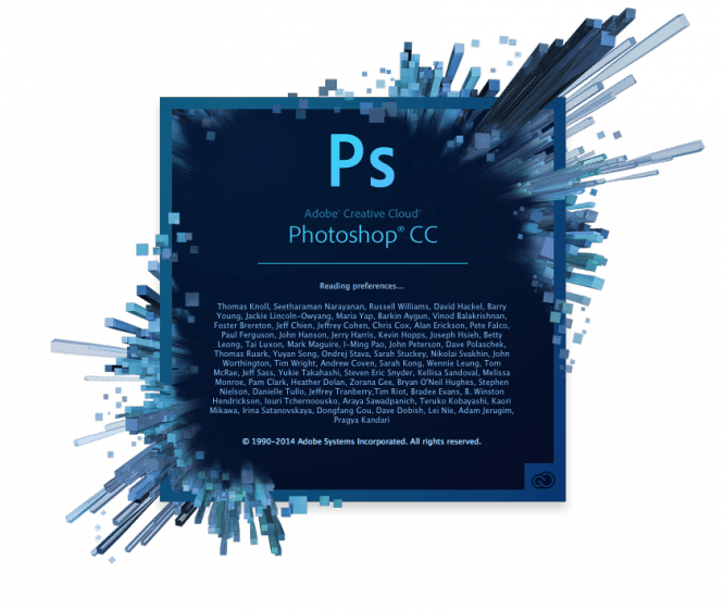
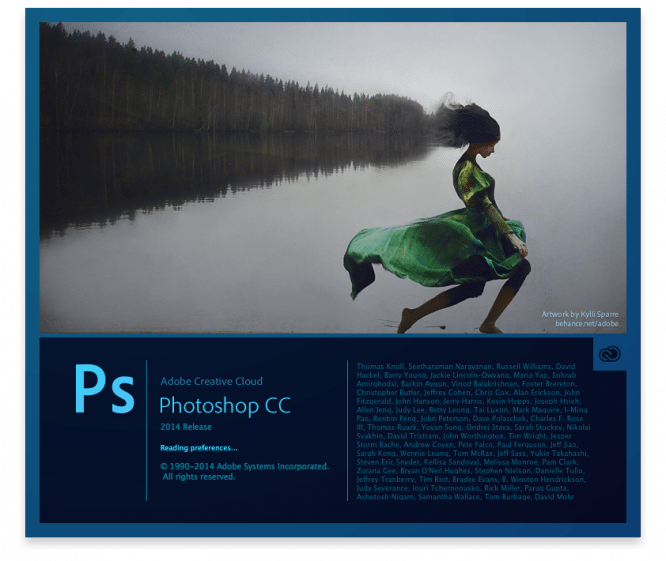
Here’s what the splash screens look like when launched on Photoshop CC 14.2.1 and Photoshop CC 2014:
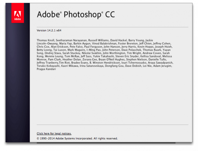
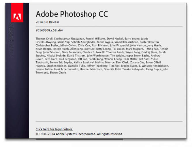
We slightly changed the view in the About window:
And this is how the “alternative” splash screen looks for both versions, which is called (on Mac) by Photoshop> About Photoshop … with the Alt and Cmd keys held down:

The app icon has not changed much.
New photoshop loads on my computer about 5-6 seconds faster, the total startup time is 12 seconds. In work, the new Photoshop is a little more nimble than its predecessor, but it did not speed up much. But he eats 20-30 megabytes more memory.
I must say that now when Photoshop CC (2014) exits on my computer, it gives an error every time. Obviously, this bug will be fixed in the next update. But not very pleasant.
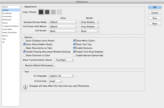
The first thing that catches your eye is a slight change in the style of controls for dialog boxes. Buttons and checkboxes now look slightly different. This is how it was in PS 14.2:
And like this in the new version:
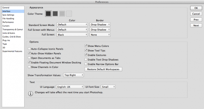
As you can see, the windows have become more compact, the distances between the controls have increased slightly, the text on the left has become larger, the background of the windows has darkened a little, and all buttons and checkboxes have lost their blue tint and become flatter. As if Adobe are preparing for the release of Yosemite, but did not dare to make a full “flat”, but carefully reduced the level of gradients. At first, this view is a little annoying, but then you quickly get used to it.
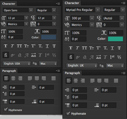
The font size has been increased on all panels, so now you don’t need to strain your eyes on large monitors:
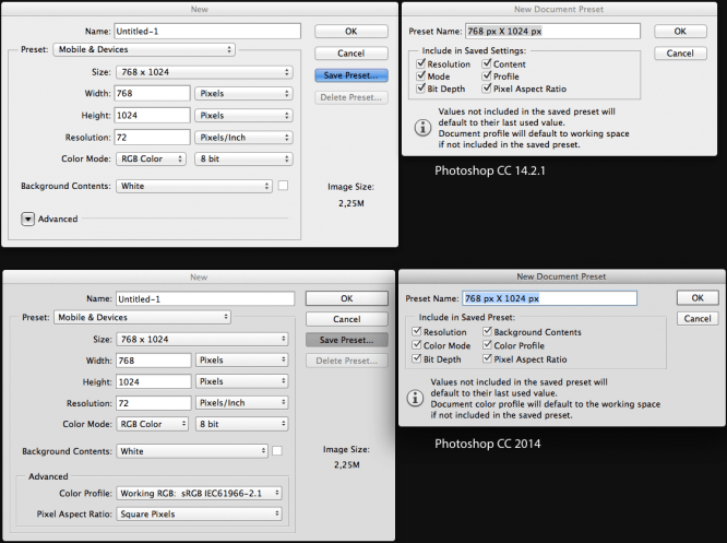
Small changes were made to the New window: now the Advanced options are always shown, they do not need to be opened with an additional click, and in the window for creating a new preset, some items were renamed:
The windows for opening and writing documents, as well as Save for Web, have not undergone any special changes.
Now let’s take a look at the main functionality of the updated Photoshop.
The most, perhaps, the main innovation that many will like is the ability to dynamically track the distance to the boundaries of objects and the edges of the document. Obviously, this feature was borrowed from the Sketch program, which I wrote about in my recent article.
Now, when copying an object with the Alt key pressed, all distances from the boundaries of the original are dynamically displayed:
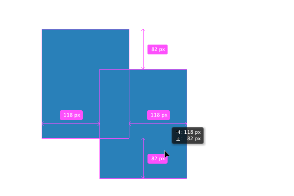
Holding down the Cmd key (Ctrl in Windows) and hovering to an object shows the distance to it. Moreover, this value changes dynamically if you move the object with the arrows on the keyboard:
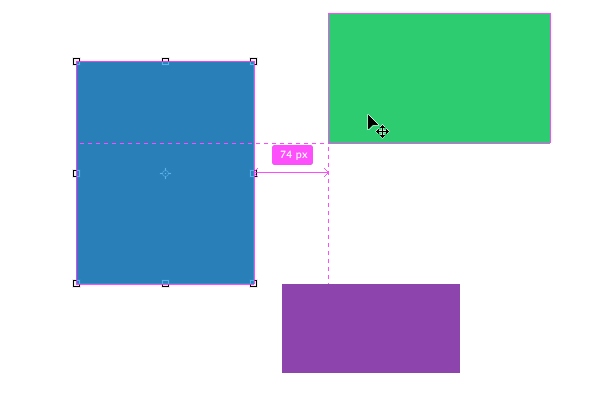
If, while holding down the Cmd key, if you hover over an empty area not occupied by any objects, then the distances to the document boundaries are shown:
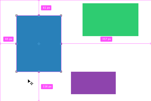
And finally, when copying objects with the Alt key held down, at a certain moment, the next copy will jump into place with the same offset value as the previous copy, and this value will be displayed on the screen. This is very convenient for quickly placing multiple copies at the same distance from each other:
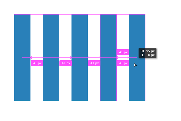
The ability to not only include smart objects in the body of the document, but also embed them as Linked Smart-Objects turned out to be very curious. This should reduce the size of the received documents and speed up the workflow somewhat.
In addition, the work with Layer Comps has been improved, where you can now operate with linked smart objects. It is difficult to evaluate this addition yet, but I think it will be useful for many. Especially for those who regularly work with large layouts.
By the way, about the size. Now it is possible to import giant PNG files up to 2 GB in size.
Improved font handling. For example, when you open a document with fonts that are not on your system, you will now receive a dialog box instead of an annoying warning that allows you to find suitable fonts.
Added TypeKit support and font search.
And now, when flipping through the list of fonts, you will see an instant display of the font directly on the selected text object. Very useful.
But, alas, there is no support for standard system anti-aliasing with subpixel rendering yet.
A nice little thing has been added for web developers: now the Inner Shadow effect is also included in the Copy CSS command.
We did a very curious thing with the blur effects. Now there are a myriad of them. And they are divided into Blur (Average, Blur, Blur More, Box Blur, Gaussian Blur, Lens Blur, Motion Blur, Radial Blur, Shape Blur, Smart Blur, Surface Blur) and Blur Gallery (Field Blur, Iris Blur, Tilt-Shift , Path Blur, Spin Blur). There are 16 types of blur in total! At the same time, there is absolutely no possibility of blurring the underlying layers, as is done in Sketch. Yes, without Background Blur, the design of iOS apps is somewhat difficult. It seems to me that it was not worth breeding such an unimaginable cohort of various bloers, but it was quite possible to try to combine them all into a single interface and give the opportunity to choose the type of blur already inside. Better yet, you would have done the blur as an effect included in the styles, as you did in Sketch.
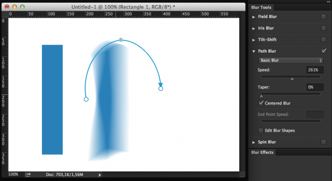
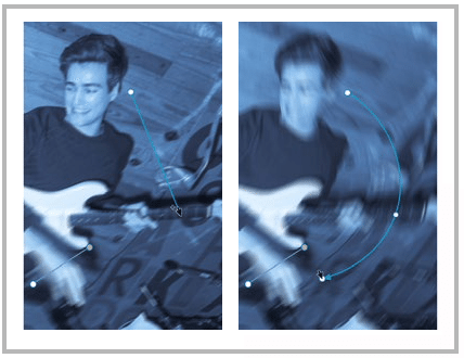
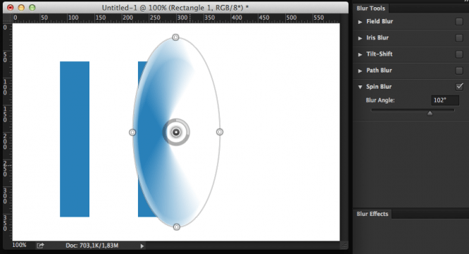
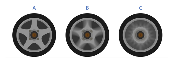
The most noteworthy are the Path Blur and Spin Blur types. To a certain circle of designers, these innovations will seem very convenient and useful.
Path Blur allows you to blur an object along an editable curve, which can be very useful for creating a trail of a moving object:
And Spin Blur will come in handy for those who want to revive the wheels of cars, motorcycles, bicycles, etc .:
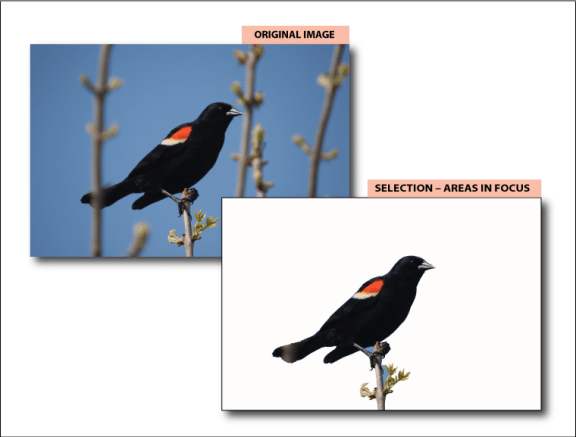
It is now possible to separate an in-focus image from a more blurred background. For this, the Select> Focus Area option has appeared:
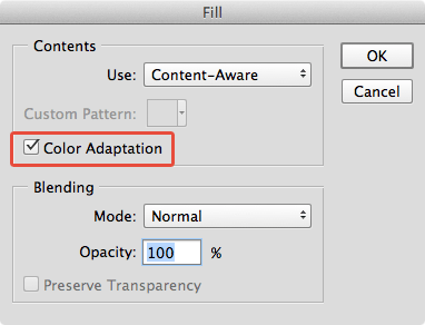
The tools and commands of the Content-Aware series (Fill, Patch, Move, Extend) have added the option of color adaptation of the replaced area, which allows you to achieve a more realistic blending of borders:
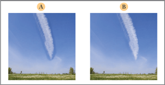
This is how Content-Aware Extend looks like in the previous version of Photoshop (A) and in version 2014 (B):
Moreover, the Move, Extend and Patch tools have added adjustment of the color adaptation level:
Also updates were made to Photoshop Generator, working with 3D objects, synchronization, improved texture support, etc.
Alas, in addition to the aforementioned Background Blur, they still have not done a coherent work with styles, as it is implemented in Sketch, have not added multiple fills, shadows and strokes, have not implemented subpixel rendering for fonts, and have not tried to somehow optimize the workflow for more modern trends …
Photoshop follows a long-beaten path: based on the paradigm of working with layers of twenty years ago, it only swells from year to year and acquires new functions that often turn out to be of little use.
A full list of innovations and improvements can be found here:
- About Photoshop 2014 in Russian
- About Photoshop 2014 in English
Official video roundup of new features in Photoshop
A full overview of the innovations in English can be seen in this video:
Author: despoth
Source: Habr
…


