6 Things Every Designer Should Know
6 Things Every Designer Should Know
This article will be useful both for beginners and students studying graphic design, and for those who just would like to brush up on their knowledge in this area.
Any field of activity has a specific professional jargon and key terms, and graphic design is no exception. We’ll walk you through six of the most important concepts in the simplest possible way, and we will also suggest useful sources for exploring them in more depth.
1. Raster and vector graphics

Bitmaps (also known as bitmaps or bitmaps) are made up of thousands of pixels, which are responsible for the color and shape of an image.
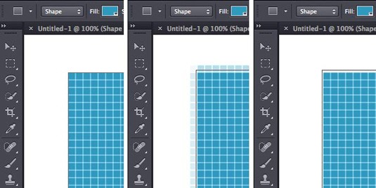
A well-known example of bitmaps is photographs. The most popular graphic editor for working with raster is Photoshop (Photoshop). This program allows the user to perform various manipulations with color and other pixel parameters. However, since a bitmap is made up of a limited number of pixels, there are certain issues that can be encountered when resizing the bitmap. So, when you increase the size of a bitmap in Photoshop, the program has to artificially stretch the pixels to compensate for the lack of them. And this, in turn, leads to a tangible loss of quality.
Vector images
Vector images (for example, created in Adobe Illustrator or simply Illustrator) consist of points, each of which is assigned individual X and Y coordinates. These points are connected to each other in lines, forming one or another shape that can be filled with a color fill. Thanks to this principle, vector images can be arbitrarily scaled without loss of quality.
More recently, the capabilities of Illustrator and, therefore, vector graphics have made significant headway: now you can use gradients, “paint” complex shapes, and get scalable vector images with a high degree of detail. Since vector images can be resized without compromising quality, they often appear in the form of logos and other graphic design elements that involve simultaneous use for a variety of purposes (from printing in brochures to large-format outdoor advertising).
2.CMYK and RGB

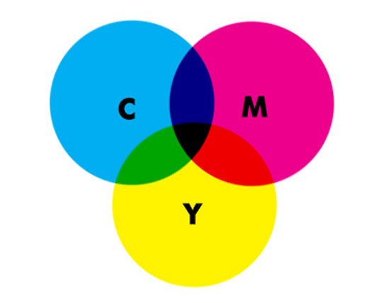
CMYK – a standard color model for sending documents to print, be it magazines, newspapers, flyers, brochures or annual reports. This abbreviation stands for Cyan, Magenta, Yellow and Key (or blacK, because in four-color printing, printing plates for cyan, magenta and yellow are neatly fitted to the printing plate with a “key” black ink, which is largely responsible for contrast and other nuances ). If the print run has already been signed for printing, the printing house prepares forms for it in cyan, magenta, yellow and black (at least when working with traditional printing machines), which are then layered on top of each other by sequential printing on paper. If necessary, you can add fifth colors, the so-called pantones, for which separate printing plates are created.
Working in Photoshop or Illustrator, the user can choose the color mode of the document – CMYK, RGB (red, green and blue – for displaying images on the screen), or some other (for a start, you just need to understand the first two). To learn more about color models, read this article.
Since the CMYK color gamut is more limited than RGB (which reproduces colors on a monitor as the human eye sees them), color loss can occur when converting an image from RGB to CMYK using the above graphics editors.
3. DPI and PPI

Image resolution is another important concept that often causes confusion. There are two main abbreviations used in this area: DPI and PPI.
The first plays a role only in the case when the created image is planned to be used in print. DPI stands for “Dots per Inch” and refers to the number of dots per inch of the printed sheet. As a rule, the more dots there are in an inch, the better the image quality. The accepted standard for printing is 300DPI.
PPI stands for “Pixels per Inch” and, as you might guess, here we are talking about the number of pixels per inch of the image. By increasing a bitmap in Photoshop, you “increase” the number of pixels per inch (due to the fact that Photoshop artificially compensates for their lack), while significantly degrading the quality. There is a simple explanation for this.
Note that resolution only applies to raster graphics, as vector images are not made up of pixels.
4. Typography

In simple terms, typography is the art of typing and arranging printed text. This is one of the fundamental concepts in graphic design and typographic training, and every self-respecting designer should understand its intricacies.
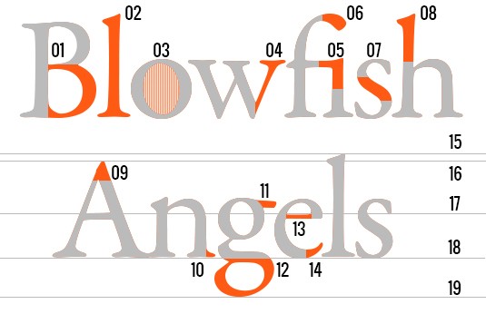
What distinguishes an ingenious designer from a mediocre one is, among other things, a special talent for distinguishing between just good and ideal font and typesetting parameters. One can be proud of the ability to spot an error in kerning (the distance between two printable characters) on the fly! For a first introduction to the basics of typography, our article “What is Typography?”
5. Modular grid

The concept of a grid in graphic design is most easily described as a series of intersecting vertical and horizontal lines used to structure and organize content. Whether you’re working in InDesign, Photoshop or Illustrator, using a grid helps you arrange elements correctly and find the perfect balance between text and images.
A common type of modular grid is a large heading block at the top, across the entire width of the document, and several columns of equal size located below it. But this is just one example: in fact, the number of variations is limited only by the designer’s imagination. The Grid System English-language resource has a wealth of useful information on the topic of grids, including various templates with layout ideas. Another must-have item in our list of recommended reading is “Modular Systems in Layout” by the founder of the Swiss graphic school Joseph Müller-Brockmann.
6. Development of a logo and corporate identity

The importance of logos can hardly be overestimated, because a well-thought-out brand name immediately brings to mind the association with its company or product. For a designer, developing a logo is, first of all, a responsible task, which consists in expressing the entire essence of the client company in a single graphic image. Truly good logos quickly take root and are used for many decades, and therefore the development of a new design can have the most unpredictable consequences, because the familiar and familiar is replaced by something new and untested.
The development of a corporate identity and the development of a logo are, albeit interrelated, but still different tasks in terms of the nature of the work. Despite the fact that it is the logo that is the symbol of a brand or company and is in plain sight, the development of a corporate identity requires even more painstaking work. A well-thought-out, high-quality brand image is made up of a number of individual elements that must be read in the logo itself. We can say that the logo functions as an independent element in the corporate identity system.

Creating a good logo is not an easy task. If you’re looking to be successful in this field, we recommend starting with our comprehensive logo design guide. Remember that developing or updating a corporate identity requires a deep understanding of brand identity, its impact on the target audience, company history, tasks, functions and many other nuances. Get a feel for the basic intricacies of this work by reviewing the ten steps to creating a brand identity.
Original article: creativebloq.com
From translators: We hope you enjoyed the article. We would be grateful if you point us to mistakes in translation so that we can correct them. If you find errors, don’t hesitate to contact us.
…

