5 tools for online graphics
5 tools for online graphics
The era when your own website seemed like something unattainable is long gone. Now everyone can create their own page without ever opening a graphical editor, without writing a single line of code, and without even downloading special software. All this is thanks to the services for creating websites.
First of all, it should be noted that all services are designed for beginners and non-professionals. For all the attractiveness of the resources described, none of them can replace the graphic editor. Therefore, the method of creating sites “the old fashioned way” retains its position.
Readymag
For a detailed overview of the service, see the article “Trend in Web Design 2015: Visual Layout”.
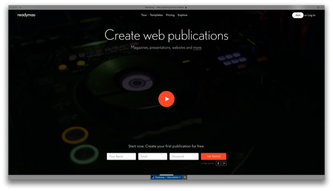
The simplest tool for creating microsites from the Russian development team. In your arsenal – basic tools for working with text and design, auxiliary elements for layout (columns and dividing lines), import of media files.
Like many other online tools, Readymag is not flexible enough and requires additional work in graphic editors. Moreover, many elements necessary for a full-fledged design are not taken into account – there is no snapping of objects to the pixel grid, the quality of uploaded photos deteriorates.
On the basis of Readymag, you can create a microsite, presentation, web magazine or photo story using ready-made templates, or by developing your own.
Also, the freemium policy of the service significantly limits the work. The “Beginner” level account allows you to create only 1 project of no more than 10 pages. A $ 9 a month Publisher account gives you access to unlimited projects and product export to PDF, and a $ 12 a month Super Publisher adds the ability to assign your own domain name to a project.
Pros:
+ Nice design;
+ Ease of learning;
+ Ability to create a product with responsive design.
Minuses:
– “Dragon” freemium;
– Limited design options;
– Lack of SEO options;
– Minimal work with source code.
Froont
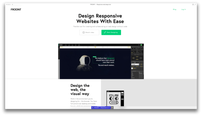
A nice tool for building websites with an emphasis on the responsive design of the original product. According to the developers, a site that complies with the following principles can be considered “responsive”: mobility, relative size of objects, working with maximum and minimum values, using checkpoints to transfer objects depending on the screen size of the device on which the site is viewed. Responsive design is an integral part of the concept of responsive design, which implies the same readability of the site on different platforms.
So what does Froont offer us? The work is based on a content library consisting of blocks-layouts, free photos and basic elements (text, photos, media files, code). For advanced users, “Expert Mode” is provided, which opens up new possibilities. Without stopping from the process of creating a site, you can see how it will look on the screen of a personal computer, tablet or smartphone. At the same time, the service itself creates control points and other elements of a responsive design. The finished project is freely typeset into a convenient html css code.
For all its advantages, Froont offers the user acceptable freemium terms. A free account allows you to create up to 10 projects, without exporting materials in ZIP format and protecting projects with a password. The “Scout” account expands the number of available products to 50 and to 10 private ones for $ 103 per year. Freelancer costs $ 205 a year and offers 100 projects, Agency removes all restrictions for $ 470.
Pros:
+ Easy to learn;
+ Extensive opportunities;
+ Automatic page creation with responsive design;
+ Neat code.
Minuses:
– Often freezes on weak machines;
– Limited SEO options.
Ahoba
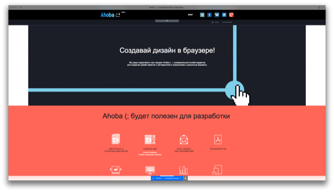
Russian project designed to create static web pages, CMS templates, presentations, banners and much more. The project is rather crude and devoid of many useful tools. Of the advantages, it can be noted only that the automatic layout in a fairly clean html css code.
In the rest, the service is inferior to others in this list. Inconvenient interface, limited capabilities, difficulty in navigation and mastering, not the most attractive design. The creators themselves speak of him as follows: “he knows almost nothing, but already comfortable, pleasant and just cool.”
All the shortcomings are explained by the fact that the project is at the initial stage of its development. Therefore, we can hope that they will be corrected in the future. You can help developers by purchasing a three-year subscription to the product. The authors left the price to be chosen by the user independently.
Pros:
+ Convenient layout in a neat code.
Minuses:
– Inconvenient interface;
– Limited opportunities;
– Difficult to learn;
– Mediocre design.
Webflow
For a detailed overview of the service, see the article “Trend in Web Design 2015: Visual Layout”.
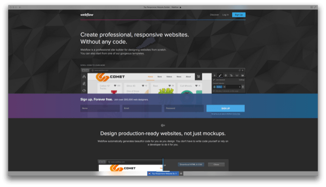
A tool for creating websites with a responsive design, even surpassing Froont in power. Here you also operate with similar objects (templates, headers, text, media files), adding them through the Add menu. The Style menu configures all possible parameters of the selected object. In terms of the number of parameters and their elaboration, Webflow is slightly inferior to professional graphic editors. Because of this, it is difficult to learn and inaccessible for beginners.
Among the downsides is limited access to the source code – html css code is available only as a preview, full versions can be obtained only by upgrading your account to the level of “Personal” or “Pro”.
By the way, about the freemium policy. In addition to regulating the number of available sites and options, it regulates the number of forms available for the site guest to fill out, the number of pages on the site and the weight of the downloaded information. Also, this service is one of the most expensive: the “Micra” level, which removes restrictions on the number of public sites and opens access to a domain name, costs $ 14 per month, the already mentioned “Personal” and “Pro” – 16 and 35 dollars, respectively.
Pros:
+ Powerful editor;
+ Extensive opportunities;
+ Automatic creation of a responsive website.
Minuses:
– High cost;
– Limited access to html css code.
Nethouse
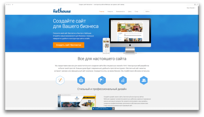
Another Russian-language service designed to create websites for business. Immediately after registration, he offers you a template from which you can make an online store, corporate site or business card site. Nethouse is a simple block builder, so there is no wide range of editing, design and SEO options. The features of the service are due to its focus on business. Here you can connect applications: payment systems, counters, ad units, search engines and much more.
Pros:
+ Ease of learning;
+ Ability to connect applications;
+ Relative cheapness of a premium account.
Minuses:
– Limited opportunities.
Author: Vasily Fedotovsky
…


