
8 logos redesigned in 2015
8 logos redesigned in 2015
With the onset of spring, not only wildlife is awakening, but also business processes. The way companies emerge from hibernation can be traced by their activity in the framework of branding: a number of foreign brands have already noted a very interesting redesign. Let’s take a look at what this led to.
Royal Albert Hall

One of the UK’s most luxurious concert halls changed its logo in 2015. As we can see, the former face of the institution has undergone an ambiguous “cleaning”: the new logo (on the right) looks more elegant and complex due to fewer details, but at the same time includes more colors (five versus two in the old one, not counting white). Has the brand become more visually appealing? You decide.
Integrated Research Software Provider
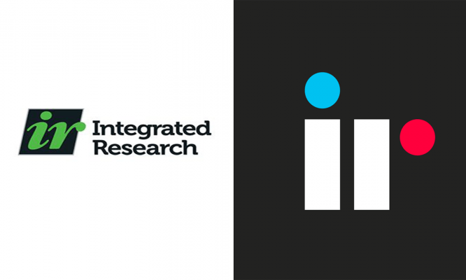
The IR logo has changed radically with the redesign. It is worth noting that the additional, third, color did not relieve him of the ambiguity generated by the schematization of the elements: it is not immediately possible to recognize the part of the letter “r” behind the pink element.
System for booking tables in a restaurant OpenTable

As part of rethinking the logo, the OpenTable management decided to move away from the idea of three-dimensional space and multiple elements. As a result, the logo became more elegant, but at the same time less clear. What do you see in the right picture: Kapitoshka or a table?
Toronto Raptors Basketball Club

One of the first sports organizations to embark on the path of minimalism in branding was perhaps the Brooklyn Nets basketball club. Toronto Raptors did not lag behind: recently, the number of details in the logo of this club has been sharply reduced, all of them are rigidly tied to the inner boundaries of the circle. Pretty cute.
Financial conglomerate Banco Popular

The owners of this institution decided not to limit themselves to simplifying the forms. After the redesign, not only secondary graphic elements but also the whole word disappeared from the logo. Be that as it may, Banco Popular’s branding is now centered around these beautiful serifs.
AllianceBernstein Management Company
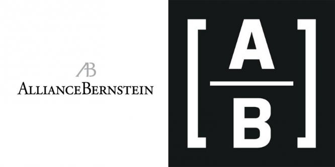
AllianceBernstein is another example of branding austerity. From the previous logo, following the results of the redesign, in this case, the abbreviation remained, enclosed in square brackets and outlined with a fraction. The logo has become more lively, compact and, to be honest, symbolic.
City of Covington
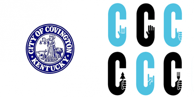
Not so long ago, we talked about the branding of Russian cities and learned how ambiguous professional design can be. Check out the new logo for the City of Covington, Kentucky, USA. With the light hand of the employees of the eminent Landor Associates, the traditional and majestic emblem of this city turns into …
Montreal travel logo
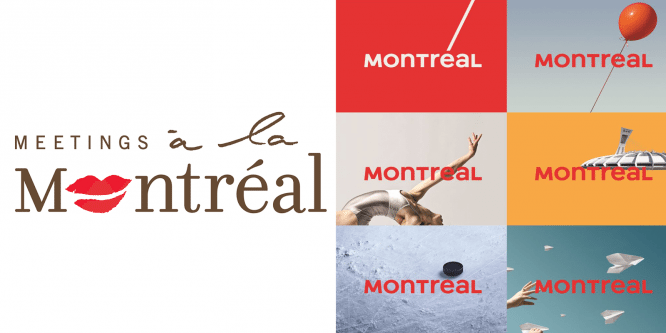
The new Montreal logo focuses on the accent symbol, characteristic of the French alphabet: the fact is that the only official language on the territory of this Canadian city is precisely the language of Hugo and Voltaire. The loss of many other symbols, which the previous logo could boast, was compensated by ample opportunities for variations, although in this case it is still too easy to confuse an acute accent with a slash.
Author: Denis Strigun
…