8 Easy Steps to Create a Great Visual Presentation
8 Easy Steps to Create a Great Visual Presentation
We bring to your attention a translation of a presentation on how to make a cool, don’t believe it, presentation. With comments by Denis Bolshakov (DB), CEREMONY, specializing in the creation of presentation videos.
one. Create an immersive story which will interest the audience and arouse curiosity

DB: Here, it seems to me, it would be more appropriate to use the word “plot” rather than “history”. The more interesting and simple the plot, the easier it is to perceive the information. The presentation should be intriguing – and it doesn’t depend on what you are presenting. And a little humor won’t hurt anyone.
2.10 slides, 20 minutes and 30th size
Highlight the most important points and focus on them. Long presentation – loss of audience interest, small print – disrespect for the viewer.

DB: Such a rule exists for the beauty of the numerical order, I tend more to 15-15-48. The shorter and more meaningful your presentation, the easier it is to build dialogue. You cannot tell everything, it is better to leave time for questions and answers.
3. Use headings – no paragraphs. Slides should complement your speech, not the other way around. As Antoine de Saint-Exupery said, “perfection is achieved not when there is nothing more to add, but when there is nothing left to take away.”

4. Use high quality images, which clearly and accurately explain the meaning of your words.

5. Complete the text with symbols and graphics. Individual items and data grab the audience’s attention.
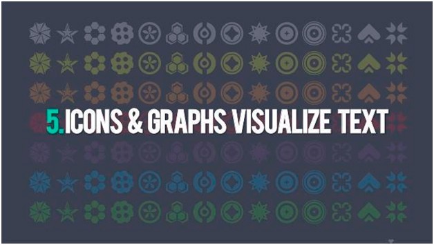
DB: These three rules are actually about the same thing. I would condense them to one: slides should complement your speech, not vice versa.
6. Design always plays a big role.
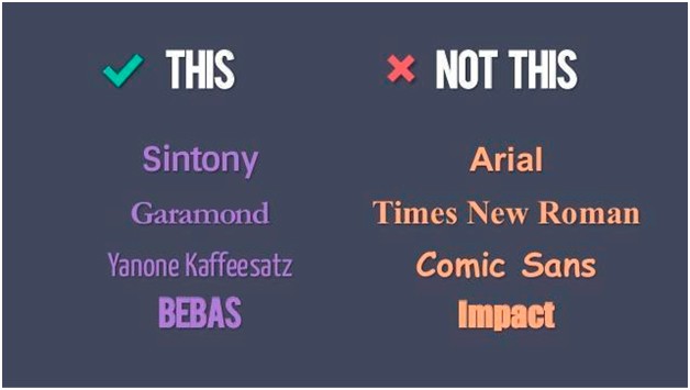
Be careful with your choice of fonts:
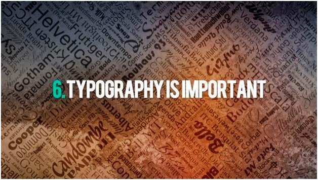
DB: In general, the choice of fonts should be approached very carefully, it is desirable to take as neutral as possible. I would advise you to pay attention to overseas startup sites.
7. Color matters.
Below is a bad choice:

But this is much better:

8. Slides must be aligned, clearly structured and in the same format.

DB: Correctly selected fonts, a unified presentation format will help you better and faster to perceive information.
Source: cossa
…

