7 practical tips to improve your design
7 practical tips to improve your design
Improve your design with tactics, not talent.
Every web developer, whether he wants it or not, comes a moment when he has to do visual design.
Perhaps your company does not have a full-time designer, and you need to create a new user interface yourself. Or maybe you are using a side project and want it to look better than another site with Bootstrap…
The easiest way is to raise your hands up and say: “I can never make him beautiful – I am not an artist!” But in fact, there are tons of tricks that don’t require professional knowledge of graphic design.
Here are seven simple ideas you can use to improve your design.
1. Use font color and weight instead of size to make text stand out

A common mistake when styling UI text is overusing font sizes to highlight text.
“Is this text important? I will make the font larger. “
“Is this text secondary? I will make the font smaller. “
…
Instead of directing all the heavy lifting to the font alone, try using color or weight for the same task…
“Is this text important? Make the font weight bigger“.
“Is this text secondary? Make the font weight smaller“.
…
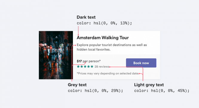
Try to stick to two or three colors:
- Dark (but not black) color for body text (e.g. article title)
- Gray for secondary content (for example, the date the article was published)
- A lighter gray for extra content (e.g. specifying copyright in the footer).
Similarly, two font weights are usually sufficient for the user interface to work:
- Normal font weight (400 or 500 depending on the font) for most of the text
- Heavier font (600 or 700) for the text you want to highlight
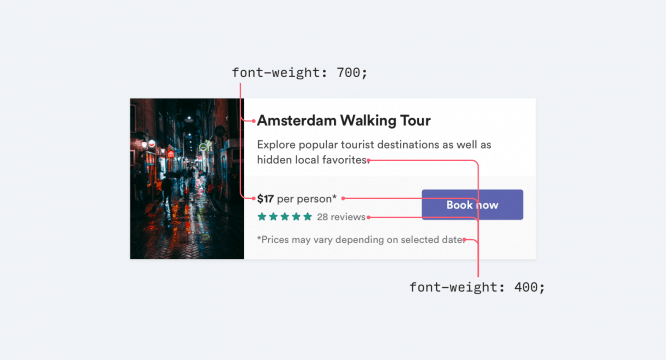
Never use font weight less than 400 for user interface… It may be fine for large titles, but it is very difficult to read at smaller sizes. If you want to use lighter weight for less important text, use a lighter color or smaller font size instead.
2. Don’t use gray text on colored backgrounds
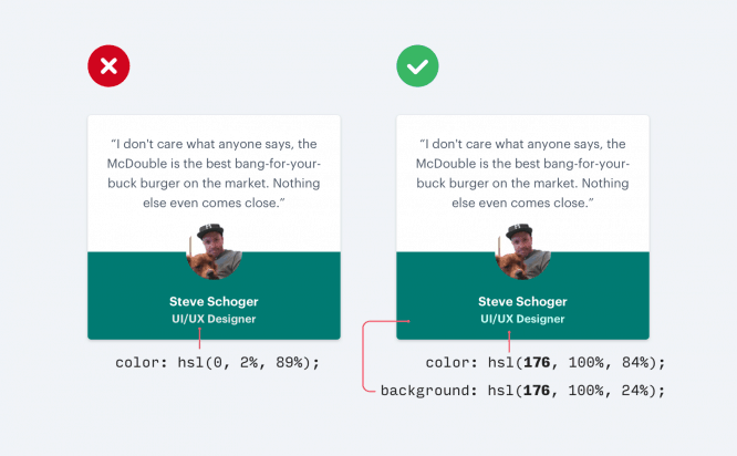
Making the less important text light gray is a great way for white backgrounds, but it doesn’t look very good on colored ones.
The fact is that when we see gray on white, in fact we see reduced contrast.
Bring the text color closer to the background colorrather than using light gray – this is what actually helps to separate text by importance…
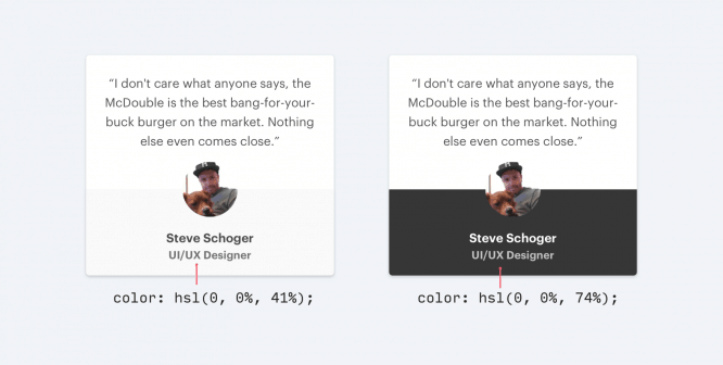
There are two ways to reduce contrast when working with colored backgrounds:
Decrease the opacity of white text
Use white text and lower the opacity. This allows the background color to bleed slightly through the text, thus de-emphasizing it without disturbing the background.
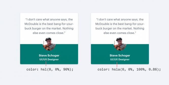
Manually pick a color based on the background color
This method works better than lowering the opacity level when the background is an image or drawing, or lowering the opacity makes the text too dull or blurry.
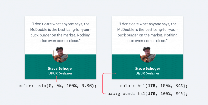
Choose a color that is similar to the hue of the background and adjust the saturation and brightness as needed.
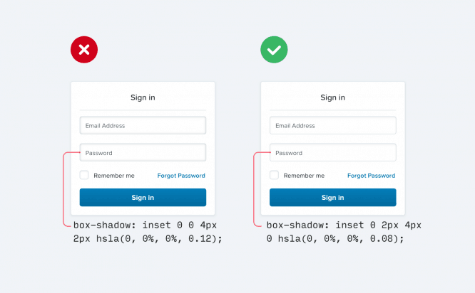
3. Move shadows
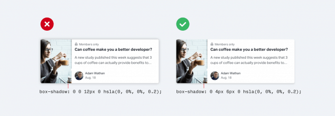
Instead of using large values for the blur and stretch radius, add a vertical offset to make the element’s shadows more visible.
It looks more natural because it simulates a light source located on top, as we are used to seeing it in the real world.
This also applies to inner shadows, which you can use in modals or data entry windows:
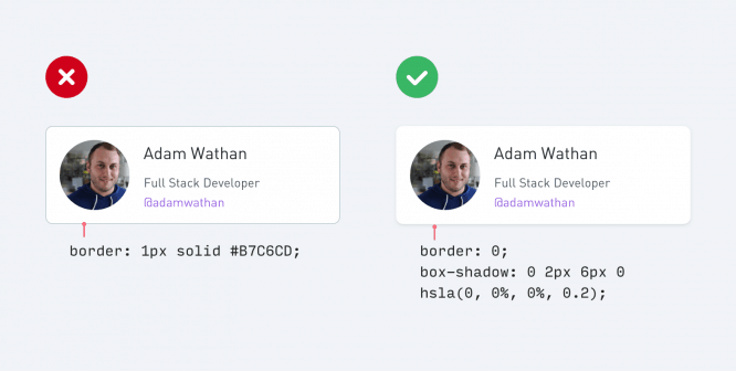
4. Use fewer borders
When you need to create a separation between two elements, try not to access the border property right away.
While borders are a great way to separate two elements from each other, they are not only way. Moreover, if you use too many of them, you can overload the design with elements.
The next time you’re dealing with boundaries, try one of the following:
Use a block shadow
Box shadows are great at making an element stand out like a border, but can be more subtle and do the same thing without distracting attention.
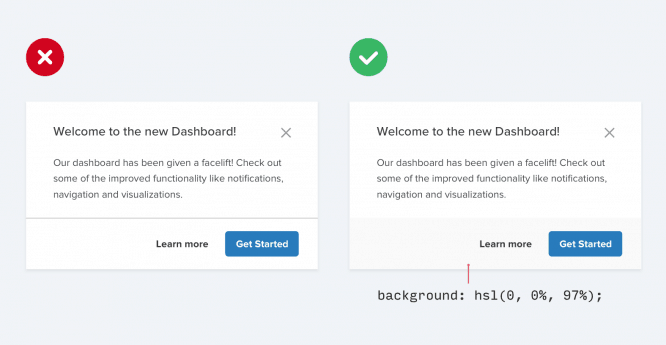
Use two different background colors
Applying slightly different background colors to adjacent elements is usually enough to separate them. If you are already using different background colors in addition to the border, try removing it. You may not need it.
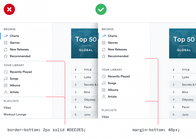
Add more space
What’s the best way to create separation between elements? Just increase the distance! Placing elements farther apart is a great way to differentiate between groups of elements without introducing a new interface.
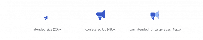
5. Do not enlarge the icons, which should be small
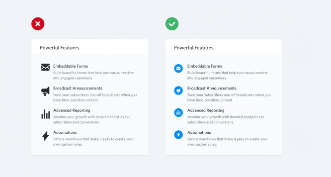
If you are developing something that can use multiple large icons (for example, the “Features” section on the landing page), you can take a free icon set out of habit, for example, Font Awesome or Zondicons, and increase their size until they meet your needs.
After all, these are vector images, so the quality will not deteriorate with increasing size, right?
Indeed, vector images do not lose quality as the size increases. Nonetheless, icons created at 16-24 pixels will never look professional if you enlarge them 3-4 times their intended size… They lack detail and always seem disproportionately “bulky”.
If you only have small icons, try placing them in another shape and adding a background color:

This allows you to keep the icon at its intended size while taking up more space.
If your budget allows you, you can also use the premium icon set designed for use at larger sizes, such as Heroicons or Iconic…
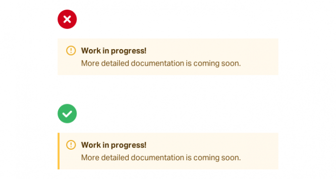
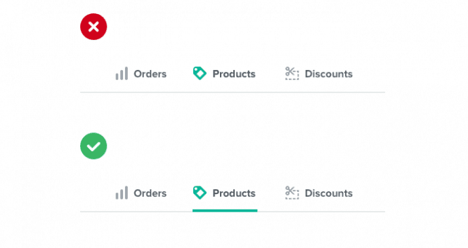
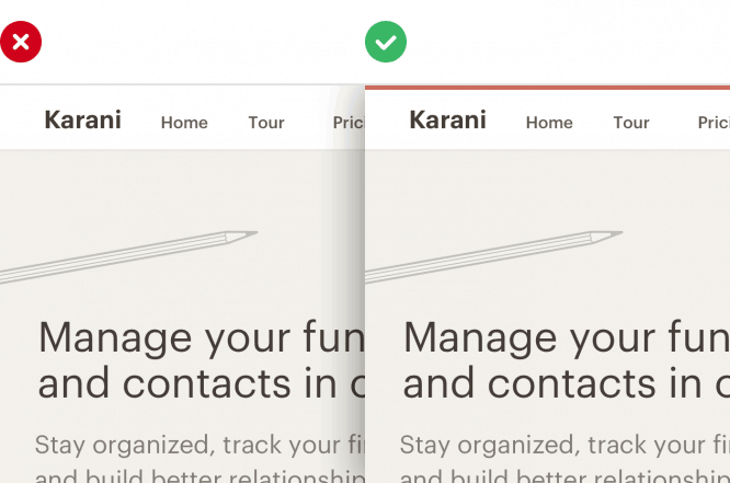
6. Use accent borders to add variety to your designs.
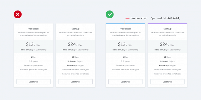
If you’re not a graphic designer, how can you make an interface visually appealing without using pretty photos and colorful illustrations?
One simple trick that makes a big difference is to add colored accent borders to parts of your interface that would otherwise look dull.
For example, on the side of the warning message:
… or to highlight active navigation elements:
… or even at the top of the entire layout:
You don’t need to have a graphic design talent to add a colored rectangle to your user interface, but it will help make your site look more “designer”.
Difficulty choosing colors? Try to choose from a limited palette such as Dribbble’s color searchso you don’t get lost in the endless variations of the traditional color picker.
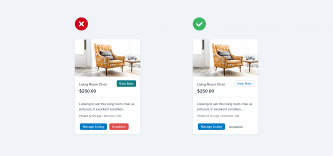
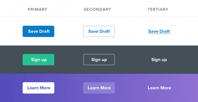
7. Not every button needs a background color
When a user can take multiple actions on a page, it’s easy to fall into the trap of styling those actions based solely on semantics.
CSS frameworks like Bootstrap encourage this by offering you a semantic menu when you add a new button:
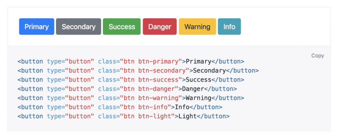
“Is this a positive action? Make the button green“.
“Does this delete data? Make the button red. “
…
Semantics is an important part of button design, but there is a more important aspect that is usually overlooked – hierarchy…
Each action on the page occupies a specific place in the pyramid of importance. Most pages have only one really important action, a couple of minor actions, and a few infrequently used least important actions.
When designing these actions it is important to communicate their place in the hierarchy…
- Key actions must be visible… Solid, high-contrast background colors do a great job here.
- Secondary actions should be clear, but not very noticeable… Styling the outer border of an element or a lower contrast background color are great options.
- Least important actions should be visible but unobtrusive. Styling these actions like links is usually the best option.
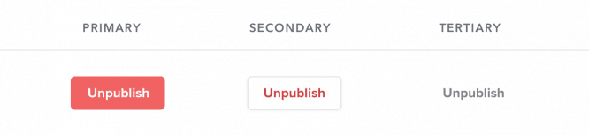
What about deleting actions: shouldn’t they always be red?
…
Not necessary! If the delete action is not the primary action on the page, it may be better to assign it a secondary or least important button.
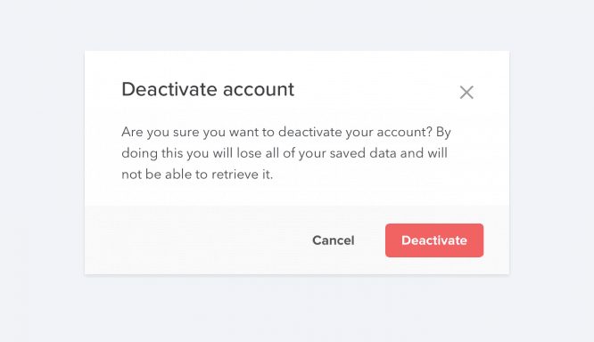
Leave large, red, and bold styling for cases where this negative action is actually the main action in the interface, such as in the confirmation dialog:
Source: DailyCODING
…

