
5 common landing page mistakes
5 common landing page mistakes
The team of the Chatra project, an online chat service for the site, has analyzed the 5 most common mistakes on landing pages that reduce conversion and discourage visitors from taking a key action.
We recently wrote that we no longer believe in large, expensive and long work with web studios. At Chatra, we believe the future lies with small, quick-build pages that test hypotheses.
These are landing pages or landing pages – now only the lazy does not make them (and he does). We see dozens, hundreds of landing pages around and found five typical mistakes in them. Hopefully this article will help you avoid them in your landing page.
1. Poor page structure
The landing page is a very simple thing. She has one task: to convert a visitor into a contact person. She collects an email address or asks to fill out a questionnaire. All!
However, many are beginning to build a whole media around this task. Here’s the landing page for the social service Gnip:

Media manager Ilya Oskolkov-Tsentsiper in such cases cried out sadly: “Where should I look?”. And really, what is a visitor to do here? Read, watch, click, switch between tabs?
Advice: Put the essence of your proposal and your call to action on the first screen. If you need to scroll, that’s bad.
Take a look at the Pencil’s landing page:
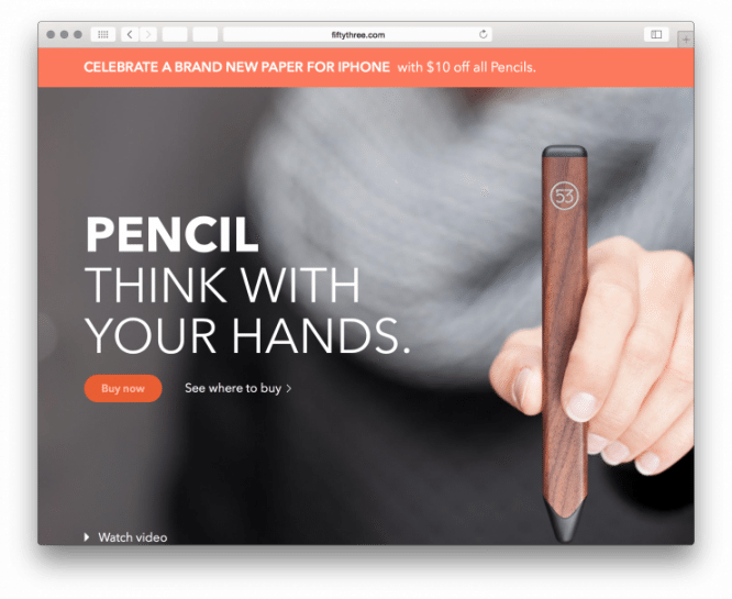
Essence -> Call to Action. Less words, more meaning. This is the law and the prophets.
2. Graphics problems
Graphics problems are of two kinds: stupid stock images and images that are too heavy.
Let’s start with the wacky pictures. Here is the landing page for the Selz service. The page advertises courses on the Internet. But a smiling girl is looking from the photographs. What does she have to do with it? How do these images relate to the essence of the landing page? It looks like nothing at all.
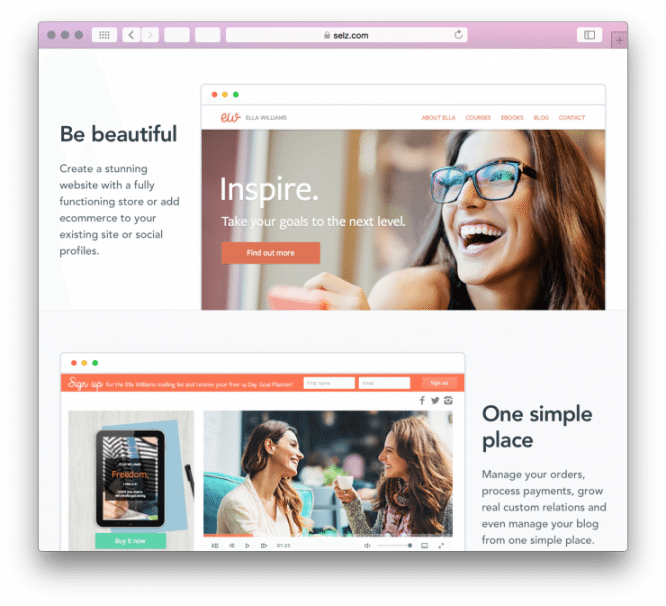
Believe me, gone are the days when users were happy with any beautiful picture. Now, along with banner blindness, photostock blindness has come to the web. No one is touched by the beautiful Western people who do abstract things. This is more annoying than attractive.
Advice: show the essence of the product or service in the picture. Not abstract people, but service creators or real users.
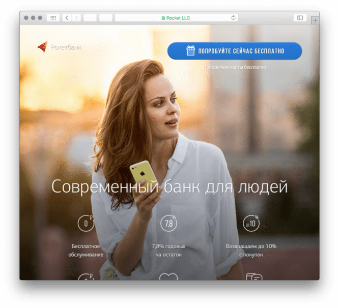
So, on the landing page of Rocketbank, a real user of the service is depicted:
Advice: if there are no suitable photographs, it is better to order illustrations. The Internet service should be shown in the screenshots.
Well, a few words about optimization. Be sure to reduce the weight of the images. Half of your landing page visitors will visit it from a mobile phone. They won’t wait a minute to download tens of megabytes of your wonderful pictures. You probably already understand about videos on a landing page.
3. Wrong communication style
The landing page speaks the same language with the visitor. If you attract schoolchildren, then you should switch to you from the first sentence, joke and show boobs. If you need adults, then you should communicate with you, be respectful and helpful.
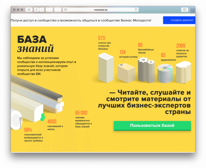
So, “Business Youth” has not yet decided how it should address its visitors: for you or for you? Push about an adult business or shout: “Click here!”. Above on the landing page “Get it”, below “Read, listen, watch.”
Advice: speak on “you” – you will not be mistaken. This is not stiffness, but elementary decency.
4. Complex registration forms
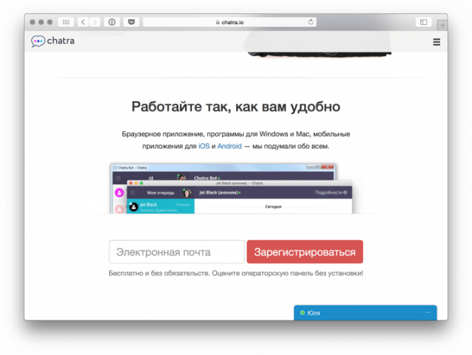
The simpler the registration form, the better. The ideal form consists of one field, in which mail is entered:
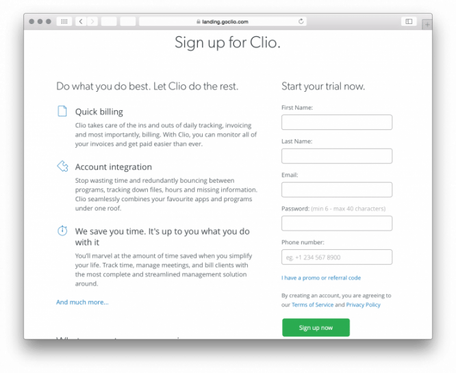
It is worse if additional fields appear, which came from an unknown source. Why should I leave my phone?
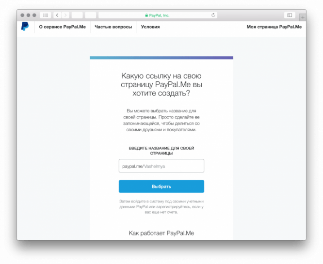
If the shape is expected to be long, it is worth breaking it down into several steps and turning it into a small onboarding. This is what Paypal does:
5. Incomprehensible call to action
The key element of the landing page Is the button that the visitor clicks on. He understood the essence, appreciated the benefits of your proposal for himself. It remains only to bring him by the handle to the call to action. But not everyone succeeds.
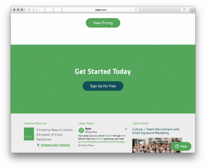
Here the user’s attention is diffused. Where to click, what to do: see prices, register or download an e-book (below)? Plus, the Sign Up Free button is preceded by a silly marketing phrase: “Get Started Today”. What to start something?
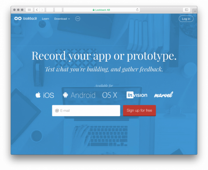
Here’s a great example. It is clear what it is and why you need to leave mail:
Tip: Always write a verb on a button. Complete it with an adjective or adverb. For example, like this: “Download for free.”
Here are some more tips on how to make a good landing page.
– Start with the structure of the page. Formulate in a couple of sentences what you want to do: collect mail, register, sell a product. Describe very briefly the key benefits of your product.
– Write the text. Use information style: fewer epithets and marketing junk.
– Make sure there is a call to action. It must be understandable and contain a verb.
– Align the structure with the text. Drag the text onto the wireframe of the structure. This can be done schematically or simply in text.
– Show the draft to a few people. Be sure to test even such a landing page bot. Ask people to rate how clear the text is. Ask what the landing is about, would you like to leave mail?
– Start drawing from the mobile version. If the landing page looks good on mobile, then it will not be difficult to develop it on the big screen. The reverse does not work – often a good desktop landing page cannot be squeezed into the narrow column of the mobile version.
– Find the right illustrations. Avoid stock photo bobbles. Better to hire an illustrator or just use screenshots.
– If there is a form after the call to action, shorten it. One or two fields are enough for you. Do not forget to add authorization via social networks.
– Layout responsively. Check that the page works on all devices. Pictures are downloaded even on a mobile phone with 3G, everything works well on iPhone and Android.
– Install support chat on the landing page. It will increase conversions and shorten the page. Users will write to you themselves if they have any questions.
Source: Chatra
…
