
4 reasons to use a vertical menu
4 reasons to use a vertical menu
The world of web design is not devoid of controversial points: for example, is it worth optimizing a site for IE6 in 2015, overusing Flash animations, and using a vertical menu in the page design?

We will leave the first two points for the judgment of descendants, we will dwell on the last one in more detail.
One page sites
On single page sites, vertical menus tend to look appropriate. The absence of a large number of sections eliminates the need to tinker with a nesting doll with countless subsections from the main navigation panel. In this case, the navigation is based on quite obvious linking of buttons with sections.
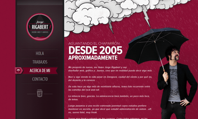
Jorge Rigabert’s portfolio site is a good example of bringing a vertical menu to a one-page template. The body of the site is divided into four colorful sections, the transition between which is carried out by scrolling or manipulating the menu. Nothing superfluous, nice to the eye and most importantly – it works.
One-column menus
But what is allowed to Jupiter is not allowed to a bull, and not every site can be made one-page. In the case of multi-page sites, the header of the vertical menu is often combined with a logo or heading: this was done, in particular, by McDonald’s, which has recently become an unwanted guest in Russia.
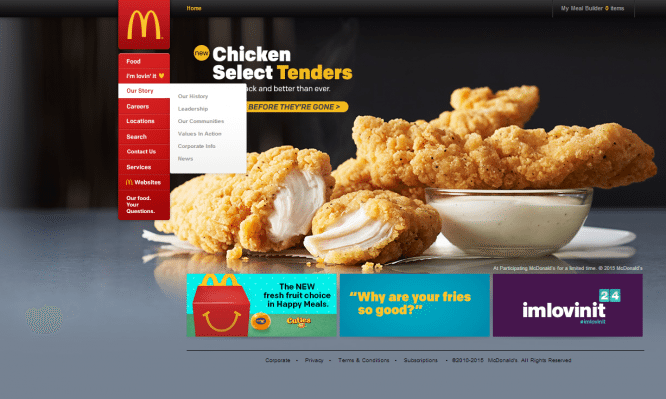
Most of the sections here are provided with sub-items that unfold to the side, which, by the way, is not so typical for this type of navigation. Meanwhile, a similar solution is encountered when using horizontal menus: in both forms, the mechanisms are identical.
Simply and easily
The use of a vertical menu often imposes certain restrictions: such navigation requires a very thoughtful layout of content, fitting fonts to size, and in case of failure, preference of some sections over others, if others do not fit. The following mantra helps: “Simplify.” Simplify menus until the right balance between content and design is achieved.
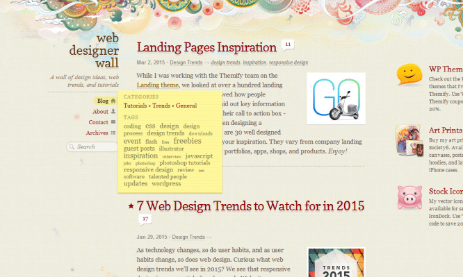
A great example of this minimalism is the Web Designer Wall blog. Bright text blocks on a beige and pink background coexist here with tiny icons, which, when using the site, manage not to be pixelated, it seems, by some miracle. On large monitors, the Blog section has a submenu that displays, in addition to the main headings of the site, key tags. The basics of composition can be learned here.
Sliding menu
Special attention should be paid to the sliding menu. Someone considers them a sign of bad taste, but this type of navigation has a number of advantages. They can be illustrated by the example of the Kick Point marketing agency website.
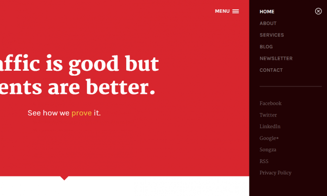
The menu expands here by clicking on the hamburger icon. By the way, such a menu is perfectly displayed on monitors of any resolution, which frees potential users from the need to purchase newfangled devices. The open menu remains fixed and is not associated with scrolling.
The main charm is that each section is assigned in this case to its own page. This is especially useful for resources focused on regular replenishment of a large array of data: it will be convenient to view such sites not only on different monitors, but also on different hardware.
You can endlessly argue on some topics. However, we see that vertical navigation not only has not disappeared into oblivion, but on the contrary, in some cases remains one of the most optimal solutions when creating a website. The stumbling block, perhaps, is always only the criterion of the expediency of our choice, even if we are talking about flirting with Flash animation or optimizing the site for unpopular browsers.
…

