20 rules for creating a quality website layout
20 rules for creating a quality website layout
Translation of an article by designer Claudio Guglieri describing the process of designing a website layout from start to finish.
While developing the site layout, I remembered the common mistakes that I met with many, especially with interns and new designers.
This short list of tips I’ve tried and tested will help you work on your next website layout.
1. Get your thoughts on paper
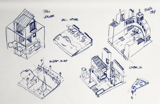
This is obvious, but many designers make the mistake of using Photoshop right away before thinking about the problem they are trying to solve. Try, for a start, to work on paper. Believe me, this is easier and better thought. And then everything else. Think about the content, functionality of the project, etc.
2. Create top-level sketches
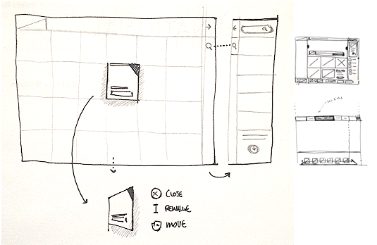
This is the first thing to do. And you also need to immediately create user interface frames that surround the text, help you perform various actions, and move around the interface. They include navigation and components such as bottom grids, sidebars, and more. If you start with this, you will have a general idea of your project.
3. Add a mesh to your PSD file
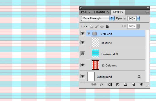
It’s simple. Before you start designing, you need a grid. If you don’t, then trust me, the project will not look very good at the end. The grid will help you structure the location of the different sections, help you be consistent in terms of distance, and many other issues.
4. Choose your typography
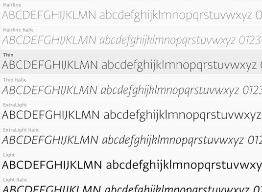
Researching different fonts and colors is an important part of the project. I would not recommend using more than two fonts on a website. But the exception may be depending on the nature of the site. Then, after weighing everything, you can choose more than two fonts, or even specify only one. But the text should read well with your font, call to action in some places. Most importantly, be consistent.
5. Choose a color scheme
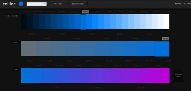
Throughout the font selection workflow, you should work on the color scheme of the entire user interface (background color, text, etc.). The colors should be chosen depending on the functionality of the element. Check out sites like Facebook, Twitter, Quora, or Vimeo.
6. Divide the layout
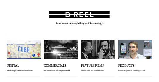
It is necessary that each section on the site tells a story. She needs a cause and an end result. The text should contain highlights, highlights, etc. for the most important parts of the text. And in fact, the page should not have too many “exits” to other resources and sources. The user should be asking the question “What can I do here?” Make it your goal to make the layout as simple as possible. And you will be surprised how difficult it is to achieve this.
7. Reorganization established

As designers, we shape the image of web pages for the user on the Internet. It is necessary to decide how many steps the user will need to take to perform some action, how effective the site will be as a result, etc. Design patterns exist because no one has taken enough time to evaluate them. It is important to rethink, test, reorganize the installed interactive models on any component and see how we can improve them.
8. Challenge yourself
This is what I encourage every designer in all of their projects. Examples of different tasks for this would be: using a new grid system when creating new components; minor tasks like avoiding blending mode or using a specific color
9. Pay attention to details
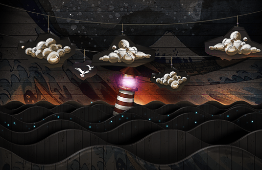
This statement has been abused recently. A detail can be some small interaction between elements, unexpected animation, or aesthetic decoration, etc. And every little thing, in the end, is essential. It’s even better if you like it.
10. Treat each component as if you were submitting it to a competition

I have to admit this is not my advice. I heard this on Fantasy Interactive and was amazed at how clear and truthful it sounded. Every detail must be designed to be the very best.
11. Hone Your Job
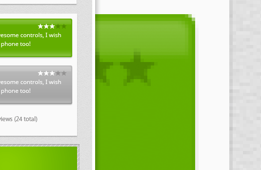
With the aesthetic perception of any work, some things can catch the eye. And you must avoid them. For example, gradient stripes, blurry edges, font rendering settings, strokes that don’t blend well with the background. These are just a few examples. But in reality, the list is endless. Always look at your overall design to see if everything works well. You can then analyze each component separately more thoroughly.
12. Clean up your PSD
This (along with the use of the grid) is one of the important tips for working with Photoshop. Despite the amount of work and tasks involved in the project, you must maintain order in your files. This will make the project lighter and export different sections to speed up the design and share files between all the people involved in the project.
13. Work hoping for the best, but be prepared for the worst.

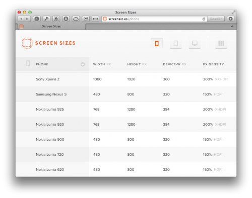
Our job as designers is to solve problems with different constraints. We must create a website that will work not only under the most ideal conditions, but also in force majeure situations. For example, the user is using the smallest screen for web browsing, which should also look comfortable. This is our task. The site should work perfectly on all screens.
14. Be fixated on design until you hate it.
If you’re passionate about your work, that’s great. Whenever I finish something, I check it diligently, enjoy the result, and can even print it as a screenshot and hang it on the wall. In the process, I get to the last moment of work when I end up hating the project, in the sense that if you don’t like your previous job, it’s a sign of growth and maturity. You can then alter it somehow or just learn from mistakes in the future.
15. Don’t waste a lot of time on concepts before you share them with clients.
When offering interactive design concepts to clients, make sure you are on the same side with them. Then you will not need to make a thousand design options, and you can calmly and confidently work on. But if the client does not fall in love with your initial project presentation, then you will need a lot of effort to collect everything that he likes. Whatever one may say, but clients are different. Everything will not always be like clockwork.
16. Designer! Be the developer’s best friend!

Developers are creative people and they love their work as much as you do. But not all of them are included in the project from the very beginning, and often only interfere in the process itself, when their efforts are no longer needed. It is not right. A lot of great ideas come from the development team you have teamed up with for a common cause. Therefore, here it is worth making sure that you are on the same wavelength with them. Collaboration will help you complete the project in a quality manner, using all the ideas.
17. Explain everything like I’m a four-year-old.
It is important not only to complete the design, but also to present it with dignity. And most importantly, it is clear to everyone. Your best work can be ignored if others can’t figure it out. Always keep in mind that the positions you understand can be like higher mathematics for an ordinary person, that is, a dark forest. Present your work in an accessible way.
18. Love each of your ideas, but don’t get too attached to them.
There is a fine line between when to stand up and reckon with the rest of the team. As a designer, I strongly believe in what I do, but I also have to be open about making compromises. Don’t forget that there is more than one unique solution. And not necessarily yours.
19. Follow the design during the process.
If you work for an agency, then you probably already understood what it is like to try to cope with a new project when the previous one has just finished. Contrary to popular belief, your work doesn’t end after submitting your PSD and stylesheets. If you really care about clients and your result, talk to your developers about the project. You may need help with pixels, etc. Make sure everything is perfect.
20. Track your progress
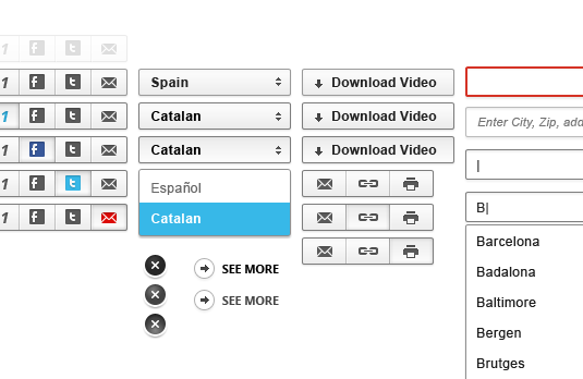
In design circles, we all love to contemplate not only the result, but the process itself. It may be that the best part of the project is lost in the archives for some reason. After the completion of the project and its approval by the customer / developer, try to create a thematic small overview exactly on the stages of your work. This is very helpful as it will give you an appreciation, experience, and feedback, thus increasing the customer’s level of trust.
Author: Claudio Guglieri
Source: lopart
Cover photo: ShutterStock
…

