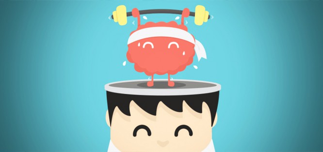
17 web design trends for 2017
17 web design trends for 2017
The designers of the Sibirix agency have collected 17 of the most trending trends for 2017: will the typography of the 80s return to fashion, will the Buy buttons become even more intrusive, and how will online stores lure visitors to their website.
On New Year’s Eve, someone is guessing on the coffee grounds and throws slippers over his shoulder. And designers are trying to probe the future and catch trends that will become the main theme of 2017. We will try too. We will rely not only on the taste and what “the art director said so”, but also on the analysis.
1. Video is a functional element
Texts are too difficult, you need to concentrate. Pictures are not informative. And video is a type of content that a modern Internet user is ready to consume and smack his lips with. And when you tell the user a story – for example, how a complex website development process is built – use it. Film and show how an analyst makes prototypes and a designer draws mockups. Immerse the user in the story and answer the questions they might have.
And stop shoving videos wherever the customer asks for something breathtaking within the budget. Video for beauty is the user’s broken hope. He looks and hopes that they will show him something useful, tell a story. But no. Therefore, as a decorative element of web design that does not perform a useful function, video remains in 2016.
Yes: A video that answers users’ questions and solves the tasks of the site.
Not: The video is in the background, because it is beautiful and in general everyone does it.
2. Cinemagrams instead of video
Use cinemagrams. They are more interesting than static images, but they do not inspire false hopes for users, as videos without a plot and purpose.
Caution! Cinemagrams are terribly sticky.
3. Font graphics
Another alternative to videos and images is font graphics. It simultaneously decorates the site and makes it more informative. The main concern here is quality content.
4. Icons are the main decorative element
Why do you need images, videos and fonts, if you can add “wow” to the icons that will be on the site anyway? Seriously, add some custom animation and end there. Be the most trending.
5. Sticky infographics
The problem with users is that they become less persistent. And forgetful, like goldfish – went to the site, then the phone blinked (oh, a false alarm – just a glare of the sun), returned to the monitor and cannot remember what they were doing here. And they leave.
The problem is getting worse every year. Therefore, the task of the designer is to hook the user and make him interact with the content, even if these are boring statistics. Especially (!) If these are boring statistics.
Animate it, paint it in bright colors, make the user interact with it – do everything to tighten the user and not let go until the end of the page.
6. Combined navigation
The increasingly popular technique – combining horizontal and vertical scrolling – will also dilute the gray everyday life of the user, interest and make thoughtfully interact with the site.
7. Refusal from the hamburger menu
In 99.9% of web design forecasts for 2015 and 2016, the authors promise that designers will certainly give up the hamburger menu this year. Straight at all. Well, let’s keep the tradition alive and also say: in 2017 the hamburger menu will be out of trend, don’t do that, ew!
The problem with the three-bar icon is that it’s not intuitive. She is recognized by the grated rolls who have already interacted with her and know what is hidden behind the symbol. But more newcomers appear on the Internet: both very small tadpoles and people of the older generation. And they don’t know or understand the hamburger menu icon. Find out what she’s hiding and where the hell is the menu, they can only go through a painful experience.
Let’s be realistic: it is unlikely that it will be possible to completely abandon the hamburger menu. But before you stick it in, look for a possible alternative on each project.
8. Frame around the site
A popular solution is not to stretch the site to full screen, but to place it in a neat frame. Nice and there is a free space that can be sharpened for navigation (why not, since the hamburger menu is dying away).
9. More emoji
The less effort the user spends to react, the more willingly he will do it. And reactions are not easier than emoji. While on sites you can only like content, the maximum is to put Facebook Emotion. But it’s time to switch to emoji, fellow designers.
10. Material design
Yes, he’s still with us.
11. More Mobile First
The number of users who browse sites from mobile phones is growing – therefore, the Mobile First approach is more easily perceived by customers every year. It is no longer considered a strange experiment, but a self-justifying method. So get ready for an avalanche of sites of the same type, but so convenient on mobile phones.
12. More microinteractions
Websites will absorb more of the features of mobile applications. In 2017, there will be chic, shivering microinteractions. Like a heart on Twitter – well, a work of art zhezh! I want to reap on him forever. This will be added to both Mobile First and classic projects.
3. The CTA is even more intrusive
For beauty’s sake, the designer muddies only the table and Dribbble. In other cases (in those for which money is paid) marketers are breathing heavily in his ear, who need something brighter here and a bigger button over there.
It seems that in 2016 there was a turning point and a rethinking of these requirements – expect big, juicy, eye-catching CTA blocks in 2017. The kind that marketers have nothing to add to them.
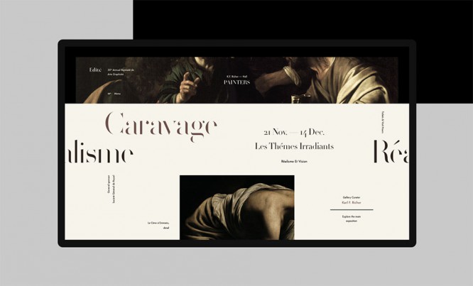
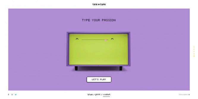
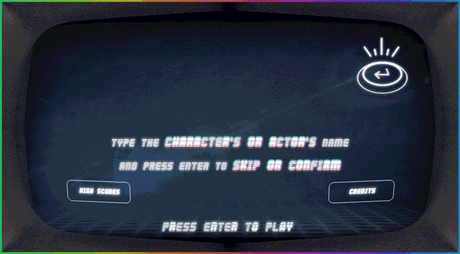
14. Nostalgia for the 80s
On the refined internet, designers miss tube pixels with a match head, eight-bit set-top box sound, and tube TV noise. And make up for their longing for the 80s and 90s in website design. Stay on trend – add acid colors, clutter and glitches to your designs.
15. Disclaimer of stock photos
Stock images are already set on edge, seriously. Worse hamburger menu and easier to replace. So let’s shoot ours.
21st century in the yard, kamon. Phones have gone such that they take high-quality photos. Therefore, it is not a problem to film employees or the process of work right now on your phone. The main thing is the time and desire to make a good project.
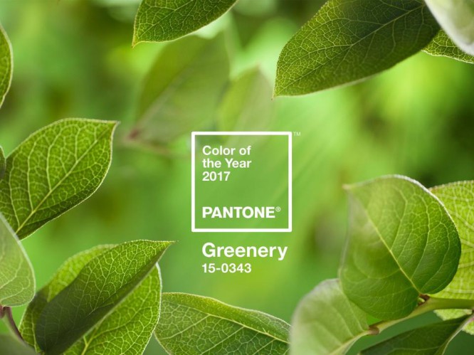
16. Greens
The guys at Pantone believe that the color of 2017 is this greenish Greenery. Let’s listen and add to our list.
17. A new approach to prototyping
No matter how wonderful a design you draw, the main thing is to present it in such a way that the client will fall in love. Or at least I saw him as you can see.
A static layout can barely cope with this task, so in 2017 you need to improve in the art of presentation. So that right away, before the layout, the customer sees all the invented pew-pew, and does not imagine them in his mind. Otherwise, he will dream of something wrong, he will create expectations that the developers will not be able to justify.
Now the designer is not comme il faut to just draw and show the picture. You need to be able to handle either one of the prototyping tools to create an interactive template, or pump over the animation part.
Here is your arsenal for the coming year, colleagues. But don’t squabble with a customer who wants a videophone. Don’t shove pixel elements and emojis where you need a clean, minimalist e-commerce business. And don’t bombard reluctant Skype clients with links to this article. Use trends wisely – or don’t use them at all. Anyway, in three years they will be completely updated 🙂
Source: blog.sibirix.ru
…