
10 web design trends of 2016
10 web design trends of 2016
Empirical Proof CEO Chris Lake has compiled 2016 web design trends in one article.
Homogenization
According to Chris Lake, the trend of “dribbling” design is being replaced by standardization. All sites in 2016 will be more and more similar to each other.
Patterns instead of pages
Modern design teams have already switched to a new principle of work – first, UI components are developed, and then, based on them, the website or service pages. In 2016, most of the teams around the world will adopt this principle.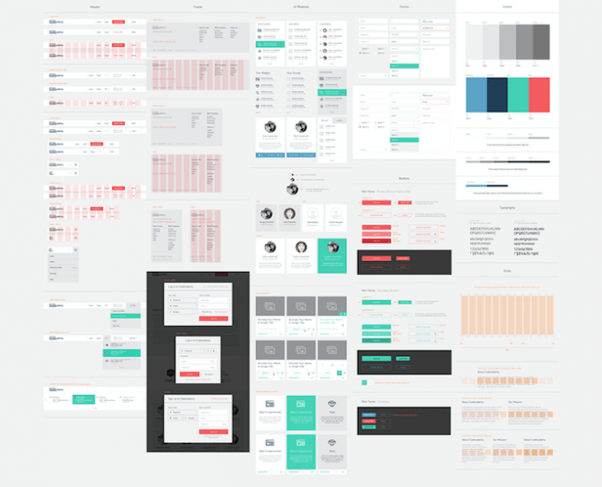
Animation
According to Lake, CSS, HTML5, and jQuery already allow you to create full-fledged animation effects – just as well as in Flash. Not all designers have yet learned how to use animation in interfaces so that they don’t interfere with the user experience.
However, in 2016 there will be more good examples of animation effects.
Rich colors and palettes
Rich colors and neon palettes will be the trend for 2016. An example is the Bloomberg website.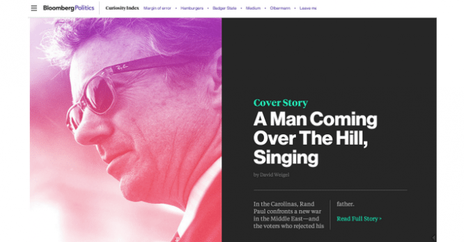
Another example is the Medium logo redesign presented by the service team in 2015. The designers used a bright green palette.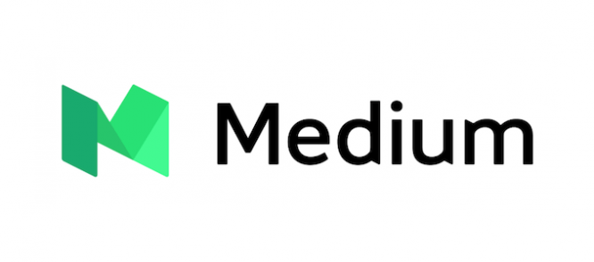
Another example is Spotify.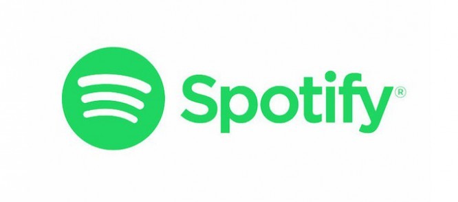
Blur the image
Facebook engineers use blur and zoom effect when loading page images. Thus, the user can see the picture even before it is fully downloaded to the computer. According to Facebook developers, this speeds up page load times by 30%.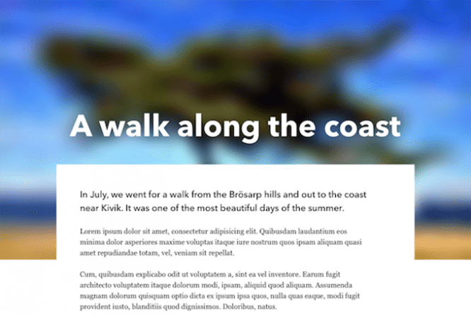
Loading the page structure
Facebook uses another trick when loading a site – displaying the structure of the page even before the content appears. While the page is loading, visitors become familiar with the design of the resource, instead of looking at a white screen or some kind of AJAX indicator.
This technique will become more widespread in 2016.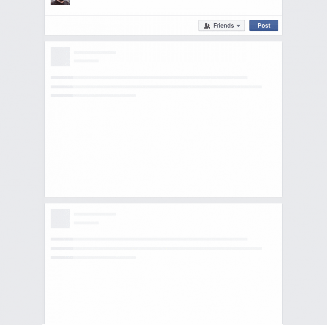
Scrolljacking
Scrolljacking is a technique where the content changes as the mouse is scrolled. For example, this mechanic is used on the Apple website:
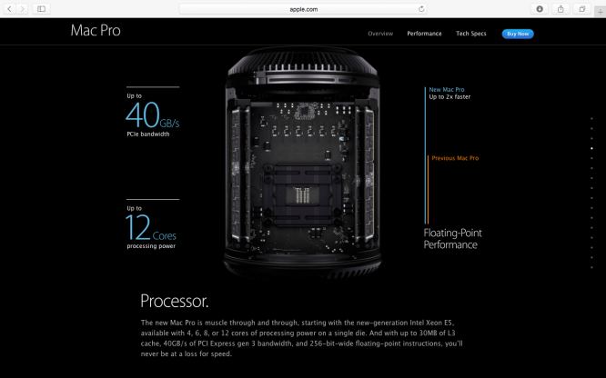
However, according to many designers, this technique is not always convenient for users, since the content does not change synchronously with the movement of the mouse scroll. This can cause discomfort in using the interface.
Lake also notes that in 2016 more and more pages with an abundance of effects and animations will appear – on such sites, it will become more difficult for users to interact with the interface.
Passive-aggressive pop-ups
Despite the dissatisfaction of designers and UX specialists, pop-ups have again filled up the Internet – forms of email subscriptions, offers to subscribe to company social networks, discounts, and more.
In 2016, according to Lake, the situation will not improve – marketers will continue to use this technique often for their own purposes.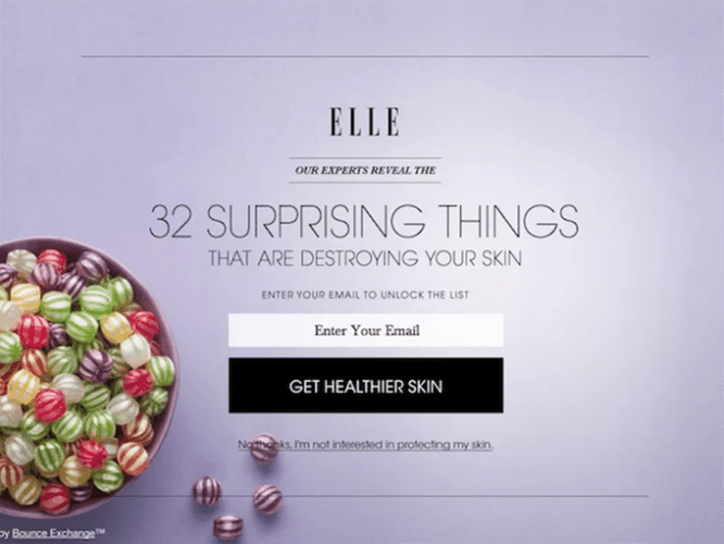
Abandoning a hamburger
In 2016, designers will begin to move away from the “hamburger” icon, behind which menu items are hidden, in favor of “visible” elements.
For example, Youtube has already switched from “hamburger” to a horizontal menu with “tabs”.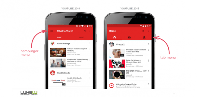
Heavy pages will get heavier
In 2010, the average page size was 702 KB, in 2015 – 2219 KB. More than tripled. And it seems that no one is thinking about limiting this growth. For example, The Daily Mail’s home page weighs in at 8.8 MB.
This, as Lake writes, has a bad effect on mobile users – the speed of the mobile Internet does not always allow viewing such “heavy” sites.
Transferred to vc.ru
…
