
10 web design trends for 2016
10 web design trends for 2016
The Wix website builder team has sorted out the prospects for the development of web design for 2016. Ahead of us are sooooo long sites, content and reader-centric projects, and simplifications of everything and everyone.
In the world of web design, life does not stand still. New ideas, techniques, tools and approaches appear almost every day. In web design, as, indeed, in any other field of activity – those who are interested in a subject and intend to understand it, need to keep their finger on the pulse and watch what is happening.
Personally, we take it as our responsibility to keep track of web design trends. Our task is to offer not only a website builder, but also the most modern templates, so that each of you can easily create a beautiful and professional website.
2015 is gradually coming to an end, so let’s talk about what will be relevant in the very near future. Think it’s early? There is only one quarter left until December 31st, so if you want your site to be in line with fashion trends, start wondering right now.
Here are our thoughts on web design trends for 2016. In general, it is curious and promising, but there are several ambiguous things.

Good news
Text + graphics = love. Get ready for designers to start using text made up of graphic elements: images, textures, and geometric shapes. Typography has always been considered an important part of web design, and with the growth of technical capabilities, its role will only increase.
Customer-centric web design. To make a good website, you need to understand what the audience wants. The idea is not new, but it is only now being seriously discussed. The bottom line is that the designer must imagine how the client uses the site, and do everything to make it as clear and comfortable as possible for him. Content and images should attract everyone, but first of all, representatives of a specific target audience.
Focus on content. A good way to emphasize the importance of a message is to place it right in the center of the page and add a powerful image or a solid background. This technique is ideal when you want to emphasize a short statement.
Content blocks. If there is more than one statement, then it makes sense to divide the page into several large blocks – this is still relevant. Blocks should not be the same as in Pinterest, but wide – to fill the entire screen. We would like to draw your attention to the fact that each block can be decorated in its own style. This gives designers a lot of freedom – no need to worry about visual hierarchy.
The bad news
Sooooo long sites. The popularity of mobile interfaces and Facebook led everyone to start making long-scrolling pages. The idea itself is not bad, especially if you know when to stop. We now regret to note that some sites are getting too long. The most common mistakes made by their creators include infinite scrolling, love for heavy animation effects, and inability to structure content.
A securely hidden menu. You could not help but notice that the familiar navigation menu has shrunk to a single icon that opens when clicked. On the screens of mobile devices, where there is little space and every pixel is important, this is really convenient, but on ordinary ones it is not always. It happens that a person does not see this icon and does not understand how to move from one section to another. The golden rule of design is, avoid unnecessary complexity. That is, don’t hide the menu or force the user to search for it.
Too many layers. The text is on top of the picture, and the picture is on top of a variegated non-uniform background. Do you think anyone would want to understand this chaos? Let’s agree to keep order. This is not difficult, for a start you can get rid of unnecessary elements placed in two or three layers.
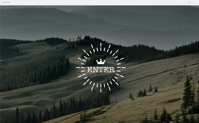
Unnecessary introduction. Modern sites have a serious drawback – they are very “heavy”. Sometimes, instead of reducing the amount of content and thus increasing the loading speed, their owners mask the problem by adding an introductory welcome page. While the user is browsing the intro, the heavyweight site loads quietly. What is the bottom line? As a result, you do not get closer to the visitor, but, on the contrary, push him away, creating an additional obstacle. The way out is to boldly remove all unnecessary things.
A bit of horror
Enumeration with applications. It’s great that you can add any third-party application to the site, but there is a limit to everything. Please don’t get carried away. Understand that different people have worked on these applications. Each of them has its own style, which often does not coincide with the style of your site. Excessive passion for applications will not lead to anything good, honestly. Our advice is to choose one or two of the most essential and limit yourself to them.
Google Deep Dream. Google’s sinister psychedelic universe inspires people to create strange things. So far, these pictures can only be seen on social networks, but we fear that very soon they will be transferred to sites. Brrr …
Source: wix
…

