10 logo design trends for 2020
10 logo design trends for 2020
Disappearing letters, flat graphics and chaotic writing – logo design trends are becoming more original and more creative.
Simplification

Minimalism is not losing ground, and many companies are making their logos even simpler and more concise. Serifs disappear from fonts, fine details disappear from images, and 3D graphics are transformed into 2D. The goal is to facilitate perception and ensure high-quality display of the logo both on the smartphone screen and on the billboard.
Custom geometry
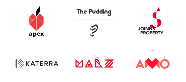
Make a heart out of geometric shapes or write a company name? Easily! Get creative – create original patterns from triangles, squares, circles or abstractions. Another popular technique, Low Poly, allows you not only to combine shapes, but also to play with light and shadow.
Original fonts
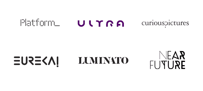
The phrase “play with fonts” takes on a new meaning. Forget about the usual Arial or Optima – typography also strives for originality. Use fancy authoring fonts and think about how to change the usual spelling.
Gradient

This is not the first season that gradient has been trending. To stay relevant, work with neon colors, but remember: the transitions should be as smooth as possible.
A jumble of elements
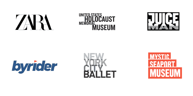
Little secret: this trick came from the world of luxury brands. Do you want your business to be associated with luxury and style? Move the logo elements closer together so that they overlap slightly. But don’t overdo it: the logo should remain legible.
Creating chaos
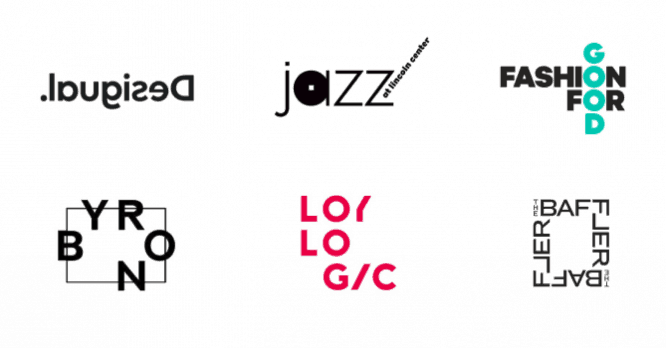
Try another cool trick: leave all the elements of the logo the same, but place them in an unusual order. Mirror the name or scatter the letters over different parts of the logo.
Letters from shapes
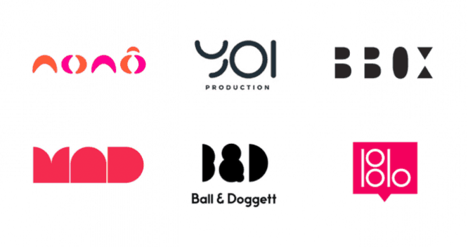
Not sure which logo to choose – text or symbolic? Trends let you combine them by drawing letters from shapes. Think about which geometry suits you best: squares, ellipses or triangles.
Emblems
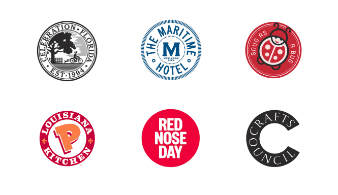
Meet emblems with an updated, minimalist design. Simplify the image, remove unnecessary details, or leave only the big name written in a circle.
Scale and thickness

Another way to change the logo is to work with the size and thickness of the letters. Add volume to the image: arrange letters from small to large or from bold to thin. This method allows you to focus on the details.
Text destruction
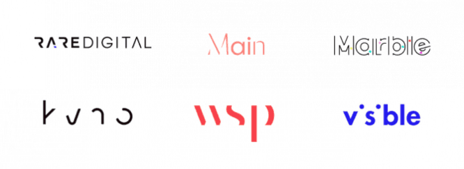
Get rid of fragments of some letters, erase outlines or make words faded. Let users solve the mystery of your logo – it will generate interest and draw attention to your brand.
To be in trend, you don’t have to completely change the logo – just look at it with a fresh eye and redesign the details. Choose the techniques that suit the nature of your business, and don’t be afraid to experiment.
Source: logaster.ru
…

