What if you are ashamed of your portfolio?
What if you are ashamed of your portfolio?
It is quite obvious that designers spend too much time decorating their work, which makes it even more cumbersome to perceive, and it becomes completely impossible to distinguish this work from others. To be honest, 90% of design portfolios look the same.
Most portfolios are just a detailed project creation process. It might sound like it sounds reasonable. However, as a recruiter, I knowhow is the process of creating project designs going. The specifics of the process look surprisingly similar for absolutely any project, and in fact, very few designers reflect what makes their work unique.
It surprises me that this approach is so common. Designers have the skills to treat their portfolios like a design exercise: understanding their users and creating experiences that fit their needs.
Or is it just my opinion? Maybe other recruiters understand something that I don’t understand? I asked this question on the Designers Guild (popular design community) and there are people who agree with me:
“I see many complex portfolios that focus on explaining each step of the design process and what happened in that step, resulting in a looped narrative of the process.” (Matthew Mang)
“Whenever I see tons of the process, I immediately know that this person is a newbie.” (Luis Guzman)
/
So what should you do instead?
Identify the problem
Again, your portfolio itself is a product with known target users and a clear metric of success:
Target user
Your users are recruiters. Each of them is looking for a needle in a haystack, and there are many needles in this haystack. They are interested in not dwelling on a specific candidate: since most candidates are below the required level, the best solution is to quickly weed out unsuitable candidates and increase the number of suitable candidates that can be viewed. Time is not on your side.
Success metrics
It’s all like promoting an online store or landing page: you need conversions. Every time a recruiter contacts you, it’s a good lead. Of course, there are good leads and bad leads.
And, as recruiter Mike Mariano remarked, “The portfolio is just the excuse to start the real interview.”
Presentation of your projects
When thinking about how to present a project, think about how to differentiate – from other designers, from other projects, from your standard approach. Sometimes it will be associated with the process (as you did what you did), but more often than not it comes down to what you did it, why you did it and what you’ve learned along the way. Tell a story about yourself and why your participation in this project gave a unique and interesting result, and not a story about the design that happened and you were there. Here’s how you can do it:
- Show, how your design and thinking evolved, and why.
- Most likely you have had several iterations and were wrong. Talk about it! These mistakes are inevitable and are in fact signs of a good, healthy design process. Moreover, they provide insight into your thinking and your ability to adapt based on new information.
- Tell us what did you find out – about problem space, about design in general, about cooperation. If you had to do it again, what would you change?
Additional pointers
- Show your work in full. I want to know what your mockups, mockups or prototypes look like in detail, and they are hard to see when you are small.
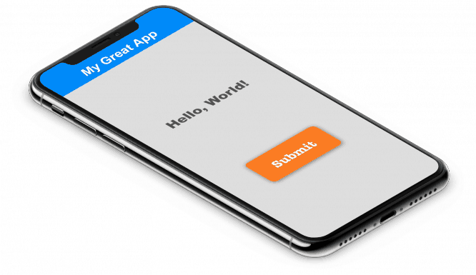
- Don’t stuff your layouts into perspective / isometric mockups. Yes, any layout looks prettier this way. You know this, and I know this, so let’s not deceive anyone. You just make me tilt my head and squint. Show me the essence, life-size, head-on.

- Let me short review your process: I want to know that you have gone through several iterations and rethinking. Literally a couple of pictures and sentences. Again, I am especially interested in the moments when you changed your approach based on new information.
- Don’t describe how the design process takes place. “Sketches are a useful step in the design process because they allowed us to iterate quickly.” I already know that, plus you’ve already included your sketches – so I know you know that too. (And honestly, I don’t even give a damn about it. If you’ve never drawn anything and I love your work, I’ll give you a marker and a piece of paper on our first day and we’ll figure it out.)
- Don’t go into the details of the process… Yes, you had two products in the first brainstorm, and three in the second. And you used the super mega-fixer Digital Insight 3000 to capture your awesome ideas. I’m not interested in this.
- Let me overview of the problem and areabut don’t go deep. I need some kind of context and I want to know that you this context was probed … but you don’t need to teach me.
- Tell me which part of the design you were responsible for you – where did you start, what were your limitations, what you changed, what would you like to change. Before / After images are incredibly valuableif can be used appropriately.
- Be short! As with any design project, prioritize ruthlessly to make sure the most important things don’t go unnoticed. Anything you add reduces the likelihood that I will catch the main point.
- Check your spelling and grammar. Not every recruiter is fundamentally important, but for meticulous ones like me, a poorly written portfolio is a strong negative signal of your attention to detail. If you are doing a project in English and you are not sure of literacy, it is better to order a translation from a friend or a professional translator.
Welcome page
Your projects say a lot about you, but your portfolio homepage makes the first impression. A few tips:
- Introduce yourself briefly, humbly and uniquely. Limit yourself to a sentence or two and focus on what sets you apart from other designers. At least half of the portfolios I’ve seen say something like, “Solve complex business problems with simple design solutions.” (I myself once wrote: “I like doing things for people.” This may also be too commonplace, but it conveys two important things: I do not like to plan things i love make things – and a little humor or irreverence.)
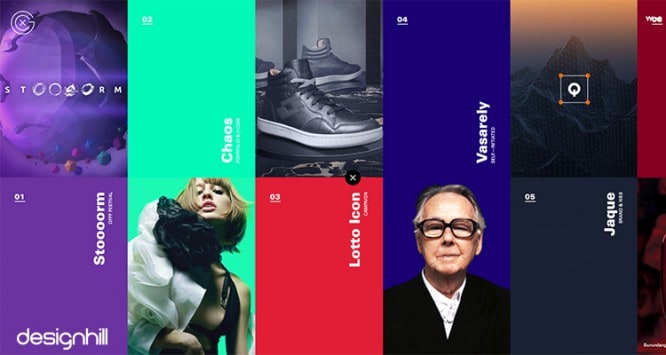
- Design your portfolio to be either standard or incredibly cool. Most portfolios are simple sites with a Squarespace builder (or otherwise), and that’s okay! If you have the time and effort to turn your portfolio design into a real showcase of your talent, that’s great, but it really takes a lot of time, and if you do not have such an opportunity, then it is better to get by with the standard design. It is better to do something polished and standard than to aim at the ideal and not finish it.
- Give a clear description of your projects! No matter how awesome you are at previewing a project, its cover can still look abstract. Think about which information will matter and which will not. One designer commented, “I don’t name my projects by company or product, I name them based on the problem.” Other useful information: the date, which part of the project you were responsible for, and the type of work.
- Put metrics on the site. If the visitor has entered only on the main page and did not look at your work, what conclusion can be drawn from this?
- In short! I’d rather see a couple of great projects than a lot of mediocre ones. In fact, I like portfolios with a small number of projects much more, because I have time to look at them all and I have no feeling that I could have missed something.
- Don’t be too clever, at least not at the expense of your viewer’s time. For example, a long animated intro is not good.
Source: DesignKabak
…


