Top 10 logo design trends: forecast for 2018
Top 10 logo design trends: forecast for 2018
Earlier, you already had the opportunity to familiarize yourself with the results of a study conducted by the Logaster service team and dedicated to identifying the most popular logos of 2017.
And now, on the eve of 2018, it’s time to predict the trends that will be relevant in the coming year.
The simpler the better

This long-term trend has firmly taken the leading position and is unlikely to be displaced from it in the near future. The minimum of details is the maximum of meaning. In addition, this principle is manifested to one degree or another even in some other trends: while retaining their key features, it encourages an acceptable simplification of the form, a decrease in the number of colors in the logo and the removal of non-semantic details.
The reason for this is the proliferation of cross-platform and Internet technologies, which requires the logo to look equally good on a business card or mobile application, as well as on an advertising banner or company website. And many well-known companies have followed this trend by simplifying their logos.
Simple geometric shapes and text

This trend can be called one of the original echoes of the one described above, as it is also based on the maximum simplicity of the logo. In this case, this simplicity is expressed in a laconic combination of text and the simplest shapes – rectangles, squares, circles, lines, points and so on.
The result is a composition that combines the effectiveness of a text logo and the ability to obtain an original visual effect through a harmonious combination of geometric shapes.
Letter constructions

Various letter designs are a trend we noticed in 2016-2017 among text logos. This is a great option for long titles and phrases: the text is lined up in a column – even or freeform. Due to this, as well as the use of additional colors or additional symbols, logos in this style look very original, so they will certainly be in demand in 2018.
Slots

Another trend that has grown in popularity in 2017, so it will be promising in 2018 as well. The slit effect is achieved by placing several wide lines in parallel over the logo so that they intersect the icon, text, or all elements at the same time.
This technique is interesting in that it allows you to make the logo lighter and more airy. There is also a reference to negative space, as some experiments with slits allow you to achieve a 3D effect or optical illusion.
Negative space

You have probably heard about this trend many times and observed it with your own eyes, because such logos have been actively created for several years. There are no reasons for the decline in its popularity, so we will only clarify that in 2018 a shift in emphasis from the image to the text part of the logo is predicted. Agree, the letters themselves, as well as their intersections, are a fairly free field for the manifestation of imagination when creating hidden images.
Experiments with text

For those who have no desire to look for hidden images in the text, there will be a great opportunity to simply combine different fonts, experiment with sizes, indents, alignment, kerning, as well as replacing letters in the logo. The designers were actively engaged in this in 2017, and next year such experiments with text will certainly continue.
Good old gradient

It would seem that the fashion for a gradient has long since passed. But in 2016-2017, this trend entered a new round of development, which will receive its logical continuation in 2018. In accordance with this, you can apply a gradient to give bright colors to both the icon and the text (looks good with massive bold type).
Overlapping

This trend has become popular, having received an impetus for development after the rebranding of MasterCard. The style itself is very simple: elements of two (or more) colors partially overlap each other, forming an area of a different color at the place of overlap. With a reasonable combination of shapes and colors, you can get a bright and eye-catching logo.
Seals and emblems

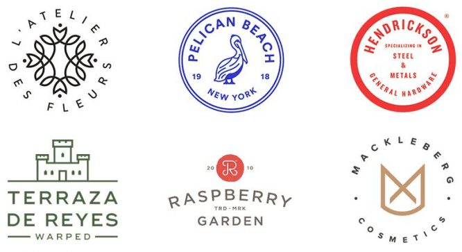
In 2017, we also noted the increased popularity of logos stylized as seals, coats of arms and other similar compositions in which all elements (text, icon) or part of them are enclosed within a circle or semicircle. Dates are also often indicated.
As a rule, this style is suitable for logos that create a sense of antiquity, preservation of tradition. Therefore, the graphic elements and shades used correspond to retro aesthetics.
Lettering

As we mentioned above, the trend towards simplification is clearly visible in the trends for the coming 2018. But lettering is still in the top ten, because it is one of the most suitable styles for logos of various barbershops, cafes, photographers, pastry shops, etc.
Of course, within the framework of this article, far from all the trends that may become popular in 2018 were considered. But we hope you find our review of these top ten potential leaders interesting. For inspiration, check out our 2018 logo design trends infographic.
Source: logaster.ru
…


