The Pro’s Approach to Logo Design (Part 2)
The Pro’s Approach to Logo Design (Part 2)
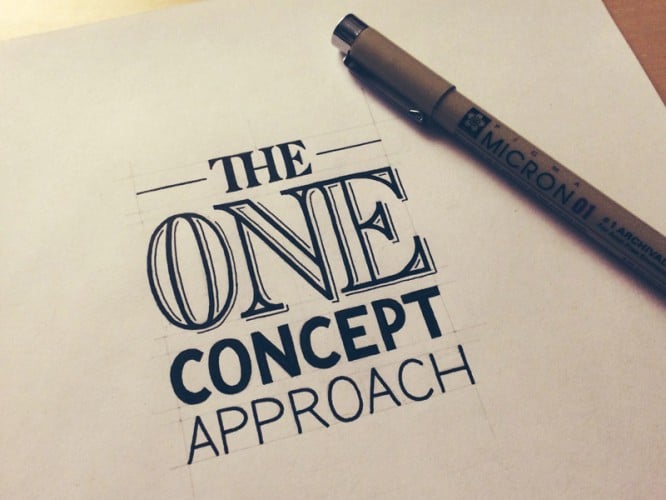
The second part of the translation of the article “The One Concept Approach: How a Professional Designs A Logo” from professional designer and creator of lettering logos Sean McCabe, who shared his vision of the problem of multiple prototypes.
Getting started
The preparatory work has been done, the expectations have been determined, the action plan has been drawn, the contract has been signed, the prepayment has been received, and now you are ready to start working. At this stage, the client already knows that you will only provide him with one option that most effectively serves the goals of the project – this is exactly what you achieved with the previous explanations.
It’s time to weed out, weed out and weed out again. From a variety of ideas, you choose the best and cut off all unnecessary. Only at this stage can you have several options, but the result should be only one. This can be achieved by reducing a number of concepts to one, the most effective form. You have to have the skills to be able to solve this based on the requirements of the project – otherwise, you simply have no place in customer service.
There can be no modifications, except for those that appear in the course of your work: and there should be many of them. This is not a task that can be solved overnight. You should take breaks several times, move away from work to look at it with a fresh eye. Try to see your work from the outside.
Evaluate how the logo works in different sizes, print it and see how it looks on paper, test it on different monitors and media. Even after I choose the final version, I spend about a week on revision.

Present with confidence
This is perhaps one of the most important steps in the entire process. You shouldn’t underestimate the need for a presentation. It is the result of weeks of searching, working, testing, and your presentation of this process must be thorough and comprehensive.
First, let’s talk about what you DO NOT SHOULD do: never send a client a design with the words “What do you think?” This is the lot of beginners. The professional does not involve the client in making design decisions, but only shows how they serve to the benefit of the project.
This means that you should record all stages of the work, for example, take photos of rough sketches and search for options, show why you chose one option over the other. Every decision must be objective. Every font, every italic, every icon, illustration, and shape should serve a specific function. Explain all this in the presentation.
Now do you see how it all works together? You are building the foundation for a successful project, doing your job well – the job you specialize in – and now you are ready to demonstrate to the client the value of the deliverable.
Presentation
How should she look? The good news: you have already put so much effort into recording the stages of work and explaining your choice that the presentation that you send to the customer can also act as a case posted on your website. Typically, only minor tweaks are required to make a presentation a good use case.
The cases published on my website perfectly illustrate how such presentations should look like. Of course, you can change their content depending on the client, but the principle is the same:
• Describe the goals of the project, obtained from the TOR and enshrined in the contract
• Show your process of work, how you focused on these goals by demonstrating attention to detail.
• Present the final version in relation to the set goals and show its effectiveness.
Call to action
After you’ve submitted your presentation, what is the next step? You are the creator, so create a call to action. It should be clear what exactly you expect from the client.
As I said before, one of the things you shouldn’t do is end your presentation with the words “What do you think?” Leave that to the newbies. You, as a professional, explained in detail the work done and showed the finished result. This is the service you provide. There should be no random modifications, no subjective desires to make changes, so do not beg for them from the client.
You position yourself as a professional who offers the best solution, and show your client that this is what he turned to you for.
Final settlement
The last step is payment. The same call to action. The presentation includes bitmaps and you inform the client that the vector assets will be shipped upon receipt of payment.
Conclusion
Without a doubt, after reading the article, you wondered. I understand that I am describing a difficult position that requires a revision of concepts. An uncompromising approach is needed, and without understanding how a professional should act, this scheme cannot be implemented in practice. Chances are that these ideas are new to you, and you are still looking for answers to some questions.
Good news: that’s what my podcast is all about.
I expected this article to create a lot of questions. For this reason, I have recorded an accompanying episode to clarify this article. This podcast is a live feed in which I answered questions from listeners from chat and twitter.
Before you ask me a question:
If you want to dig deeper into this topic and get your questions answered, listen to the podcast that complements the article.
Author: Sean McCabe
Translation: Katerina Sorokina
…


