Teamwork: How to reconcile a designer and a layout designer
Teamwork: How to reconcile a designer and a layout designer
A frequent complaint of layout designers: “They make an incomprehensible layout! Indents are dancing, headers are of different sizes and styles, elements are falling out of the grid! I don’t want to work with them. ” Designers, at one time, complain that layout designers spoil the layouts.
These complaints are complementary. If you begin to understand the root of the problem, then both will be to blame. How can these two front workers be reconciled?
It is necessary to understand that in most cases both need to change.

Designers:
1. Use a grid
It’s amazing how many people who call themselves “web designers” ignore this basic element of work. The grid sets a strict horizontal hierarchy for your layout. Most layout designers use ready-made grids or make their own, which gives them high accuracy and speed of layout.
Learn how a grid works like Bootstrap.
If you find it difficult to calculate the column sizes yourself, use a special online calculator.
Consider a 10, 8 or 4 pixel grid. In learning the 8px grid, learning the Material Design concept and this article is great.
2. Learn the basics of layout
You don’t need to dig into the details of Javascript, working with npm, git, or preprocessors. You need to master the layout in order to understand what can and cannot be done. When you yourself understand how the layout is created, you will be able to objectively assess how difficult the task you are setting for the layout designer, and, if anything, simplify it.
3. Show the states of objects in different states
It often happens that the designer does not show or even tell the layout designer about the hover effects (what they will be when hovering or clicking on an object). In such cases, the layout designer often makes the hover effect the way he sees it in his head.
Don’t make the layout designer think for you. You can show the states of objects like this:
Make one element different from the others and put the hand cursor on top of it.
In the case of modal windows, create a separate layer for it, which can be painlessly hidden, and show, using an example or through a prototype, how the window will appear and disappear.
You can also drag all hover objects to a separate sheet to show their before and after states.
4. Type
Type all objects in the layout. If this is an Open Sans 1.2em title, then let it be Open Sans 1.2em everywhere. Do the same with buttons, paragraphs, leading and indentation. We are not saying that everything should look the same – no. You should understand that the more typed objects you have, the easier it is for the layout designer to work with them. If you want to fully work with the layout designer, study the Atomic Design + BEM bundle.
5. Rename the layers
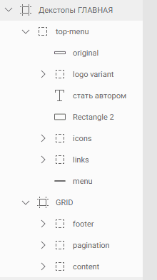
Only the lazy one did not talk about this point, but too often the layout designer receives layouts with chaotically thrown layers, the name of which does not say anything. Rename the layers according to their meaning and group by type. You can use BEM syntax in names, as well as general terms like button, header, footer, and so on.

6. Collect images and icons
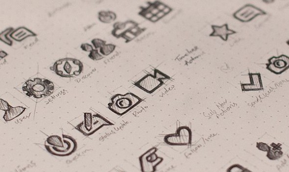
Collect all the icons and images from your layout and place them in the project folder according to the meaning. For example like this: img / photos / photo1.jpg, img / icons / facebook.svg, and so on. This simple step will help the layout designer work much faster and more efficiently when inserting graphics.
7. Create Kit
By Kit, I mean a separate sheet in which all the typed elements of the system are written: for example, headings of all levels and varieties, buttons and their variations, dividing lines, and so on. If you previously typed objects, then you can easily transfer them to Kit on a separate sheet. Thanks to this, the layout designer can safely prepare the base using the BEM methodology and assemble the site like Lego bricks.
8. Comment
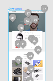
If you provide a static layout for layout, try to leave the maximum number of comments on those design elements on which questions may arise. Don’t be lazy. Take the time right away and save yourself a bunch of questions for the future. Most programs for creating interfaces allow you to do this in the most convenient way.

Layouts:
1. Look at the layout through the eyes of a designer
It is very important to evaluate the artwork of the designer before starting the layout. You may think that this or that object will be difficult to typeset, but first, understand why the designer did exactly that, and will the picture be as complete if you remove or change the object? Suggest your version to the designer, and in most cases he will explain to you why he used such a solution, and whether it is possible to change or remove it without loss for the layout.
2. Try to draw a design
To better understand the work of a designer and to truly appreciate his work, try yourself in his role. Choose any graphics program you like and draw one or several layouts, observing all the requirements that you set for the designer. Rate your work as an artist and submit it to people in chats, forums, friends and acquaintances. This will give you another reason to make sure that the designer is not eating his bread in vain … Or the fact that the artist has always slept in you.
3. Don’t make decisions for the designer
Very often when drawing from a layout, layout designers neglect some “trifles” and do not typeset them. They think that the designer just got carried away and drew unnecessary “beauties”. Not! A good designer studies the product for which he will design, thinks over the elements, composition, places everything on this layout and creates a single picture. If you have any doubts about design changes, be sure to check them with the designer.
4. Maintain a dialogue
Discuss the design. After receiving the layout, evaluate it (keeping the first point), and tell the designer in what places and why you need to make changes. What is a responsive grid and what exactly is it for. Clarify controversial points: it is possible that the designer deliberately destroyed the rhythm of the composition, and not just allowed it to be careless. If a button, link, or image doesn’t have a hover effect, ask how it should look or where it’s drawn. Be sure to discuss controversial points, then not only your work, but also the work of the designer will improve.
5. Discuss common tools for the job
Layout designers often had to receive layouts in formats that were inconvenient for layout, in which it was rather problematic to look at sizes, colors, shadows or indents. Decide with the designer which program is best for both. The variety of software on the market makes it easy to do this. Already, in the matter of creating user interfaces, you have a choice between Adobe products (for example, Adobe XD), Sketch, Figma or Framer (which just recently released the ability to create interfaces in its next release). Choose one or more programs and understand how you will interact.
Conclusion
The most important thing in the work of two front workers is to understand each other’s capabilities and communicate. As with any relationship, there must be consistency and good communication. Start implementing these points one at a time or all at once, and then the work will bring you genuine pleasure.
Source: habrahabr.ru
…


