
How to make a presentation of your project: TOP 10 tips
How to make a presentation of your project: TOP 10 tips
An article with 10 tips from Sergey Popkov, owner of the AIC design studio, which will be useful to anyone who wants to learn how to make cool cases with design projects.
One autumn day Anatoly Denisov puzzled me with a request to conduct the first global revision of the “Cases” section on CMSMagazine. Almost 193 projects have accumulated since the start. It was still aggravated by the fact that it was necessary not only to look and close, but also to choose a few of the best. And all this under the sauce of UX / UI.
In general, the essence of this material is a little broader. Savoring the best examples, in parallel, we will understand what a case is and why it is needed at all.
And if necessary, how to make a really beautiful and fascinating story out of it. From meaningless texts and incomprehensible pictures to, as it is fashionable to say, Visual Storytelling :). Go!
 http://www.aic.ru/work/site/
Why do you need a case at all?
A case is a versatile and easy way to tell about your project. This format has existed in the West for a long time and came to us from the sphere of IT specialists, advertising consultants.
In the field of web development, there have been various attempts to approach this format. Remember that once pictures were enough for a portfolio? But, one way or another, evolution took its toll. Now you can have not only a Portfolio, but also Cases. Moreover, the latter can be fantastically different. Because we can use all kinds of digital gadgets for this.
Sometimes it is enough to make 5-7 juicy and relevant cases to ensure stable traffic to your site and some kind of aura of discussions on social networks.
Cases can be different. At the start of creation, you need to understand who you are going to hook with these stories:
- Designers. Want people to come to you for inspiration.
- Clients. So that, when they come, they savor for a long time and, finally, press the “Order” button.
- Potential employees. Most likely, they will be both inspired and savoring. But, not having such skills, they will be asked to join you.
Of course, there are some tricks for each of these groups separately. But today we will look at tips on how to make sure to please everyone at once.
1. Meet on the cover
We live in an era of information obesity, which is why the reader has become insanely lazy. Therefore, our main task is to get into the area of attention and arouse interest in the first 5-7 seconds. This is how much time, on average, the user needs to make a decision: to scroll further or close immediately.
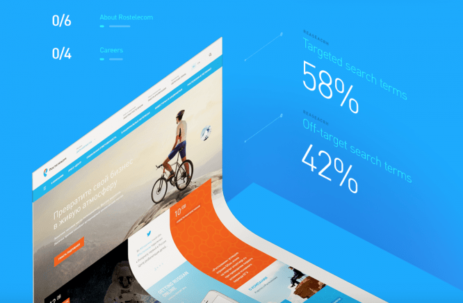
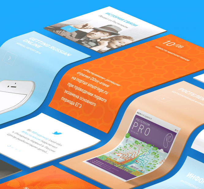
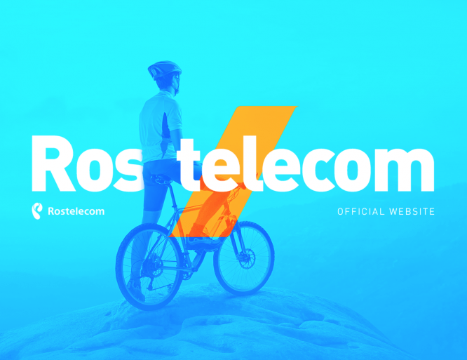 https://www.behance.net/gallery/33912080/Rostelecom
Cover is critical for the start of a case. Usually it is a bright, juicy, (sometimes not connected with reality) cover, in which you say what it is all about.
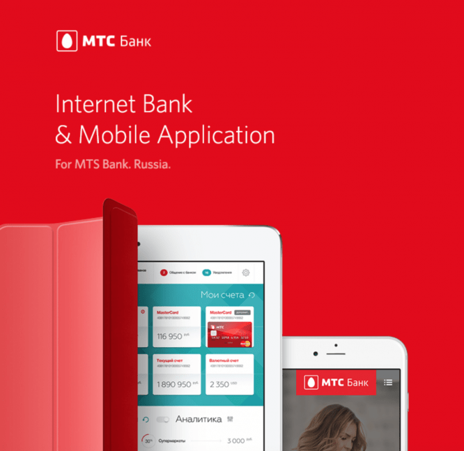 https://www.behance.net/gallery/23718699/MTS-Bank-Online
Key features:
The background in most cases should be different from white. Either plain bright or with a contextual background. Short and readable title. The main screenshot of your project can be in the device mockup. Interesting geometry or composition. An easy way to check the result yourself is to look at the cover from a distance of 2-3 meters. Should be catchy, work like a movie poster.
 www.behance.net/gallery/34555939/SHARP
2. Think in advance about the structure of the story.
Remember, a case is not just a bunch of scattered pictures. With pieces of the story, how good it was for you together with the customer at the dacha or in Photoshop. Your goal is to catch the user’s eyes and keep them in good shape throughout the entire scroll (and this, believe me, is not easy).
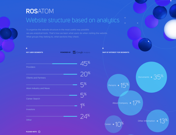 https://www.behance.net/gallery/38586573/ROSATOM
Start the case with the internal structure. Record the key points of the story in a notebook and then slowly unwind it into the prototype and graphic details.
 https://www.behance.net/gallery/33912080/Rostelecom
Key features:
- Cover
- The purpose of the project, short for 3-4 paragraphs.
- Home page
- Design or search process
- Key Sections
- Macro plans
- Results. Figures and facts
- Voiceover, directing
- Guideline
3. Optimal case length
How to saturate the user and keep him awake? Quite an important point.
I believe there are stories that cannot end simply. They are so beautiful and sweet for you that you want to continue indefinitely. But this is where the catch lies.
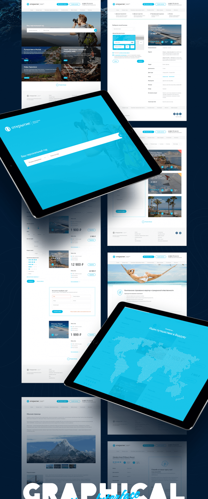 https://www.behance.net/gallery/38477227/Tour-portal-Open-bank
The reader is ready to perceive a beautiful and logical story, but within a reasonable framework. Why is the length of a good feature film 1: 30m, a series in a TV series – 45m, a music video – 3m? The same is with your case.
Key Cues: 15,000 to 20,000 pixels.
4. Macro plans and parts
Case lives by the rhythm. And our task, having set a good tone on the cover, from time to time to maintain this rhythm. This is done primarily so that the reader’s eyes do not stick. It is not necessary to part with previews of layouts. From time to time, you need to bring the most juicy moments closer in contrast: widgets, graphics, show the peculiarities of the style of illustrations.
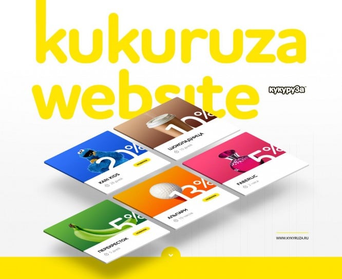 https://www.behance.net/gallery/38170861/Kukuruza
Key features: Zebra effect. Throughout the case, highlight several contrasting zones where you will show the maximum yummy. Well suited for this: isometry, large icons, infographics, animation elements, etc.
5. Text is essential but equally useless
I often come across a lot of content material. I believe this is critical. That is the only way you can tell what, and where was your USP. But, believe me, reading a lot of text, and even in a case, is stupid. We live in a digital environment where you can tell about your project in completely new languages: graphics, facts, video, interactive. And even when your project is not about visual design at all, believe me, there are tons of cool options to make it unforgettable. But not in text.
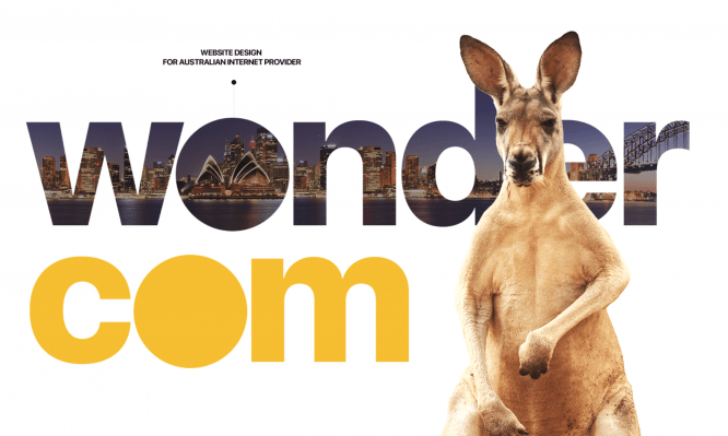 https://www.behance.net/gallery/43239455/Wondercom
Of course, you cannot completely abandon the text, but always make sure that its amount is minimal.
 https://www.behance.net/gallery/43239455/Wondercom
Key Signs: Thoughtful and tasty copywriting. Short and large titles. Revealing interlinear translations. In places 1-2 paragraphs of text. Small tips and notes.
6. More realistic and tastier
Case is a special genre. You just have to package your project as efficiently as possible. It doesn’t matter that in real life this does not happen. It must be stunning. For the reader to believe, at least within the framework of this case.
 https://www.behance.net/gallery/33912080/Rostelecom
Key features: Using unusual mockups. Isometric view.
This resource may help you a little with this: http://www.pixeden.com/
If you want to play for high stakes, check it out here: www.creativemarket.com
7. How do you do it? Tell us about the process
The last thing that most often remains a distinctive and not hackneyed trait is your personal process of finding solutions. How did you arrive at the result? Tell us about it. You can even embellish it a little. Prototypes, analytics. Everything matters.
Show more options, you can paint on something else for showiness. We do this a lot.
Key features: Prototypes, schemes, intermediate solutions.
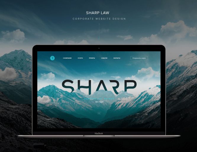
8. Don’t eat without animation
Another successful mechanic for keeping the reader in good shape throughout the story is element animation. The GIF format has received a second life.
Take vivid snippets of your interface where you want to show off unusual micro interactions. Show how it will work, even if it’s not possible. This is your fairy tale, your concept!
 https://www.behance.net/gallery/34555939/SHARP
The very squeak is when the animation elements are perfectly implanted into the structure of the case, and it seems that the elements literally come to life in the right place.
But don’t overdo it. GIF animation is heavy and CPU intensive. It is ideal to use 2-3 gifs, each of which is no more than 5-7 seconds in time.
 https://www.behance.net/gallery/24199683/ActivityStream-Dashboard
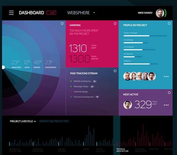 https://www.behance.net/gallery/24199683/ActivityStream-Dashboard
Key features: GIF animation, where the beginning of the video masterfully coincides with its end, forming a loop sequence.
9. We are great, but about this in a nutshell
Remember to communicate the key facts of the project, preferably in measurable terms. It can still grab attention and differentiate you from the rest. But be careful. This is a content challenge, so try to come up with something different.
 https://www.behance.net/gallery/43239455/Wondercom
And the second, which is also worth talking about at the end, is the main guideline, elements of the UI Kit. Technical details of how buttons work, tricky dropdowns, etc. All these little things, especially at the end, confirm the seriousness and attention to detail in your work.
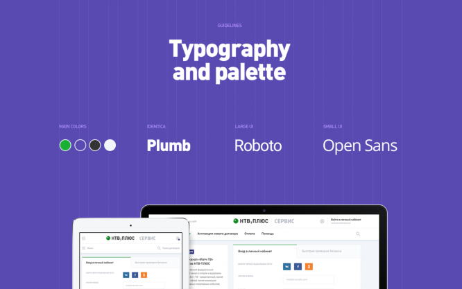 https://www.behance.net/gallery/42834421/NTV-Plus
Key features: 160 layouts, 3 killed mice, 6 sleepless nights of Vasya the layout designer. And be sure to wrap those chocolate buttons in the UI Kit for dessert.
10. Finish like Hollywood
How else to convince him that your project is really special?
In the end, there is only one thing left. Full video about the project live.
The music and the quality of the animation puts a fat point in his heart: either you or no one.
Key features: Showreel of the project. Duration 1-1.5 minutes.
Only AfterEffects, only hardcore.
Here are the basic and effective tips that should make your case special. Hope this article was helpful to you.
Author: Sergey Popkov, AIC (Owner / Partner)
Original: cmsmagazine.ru
…

