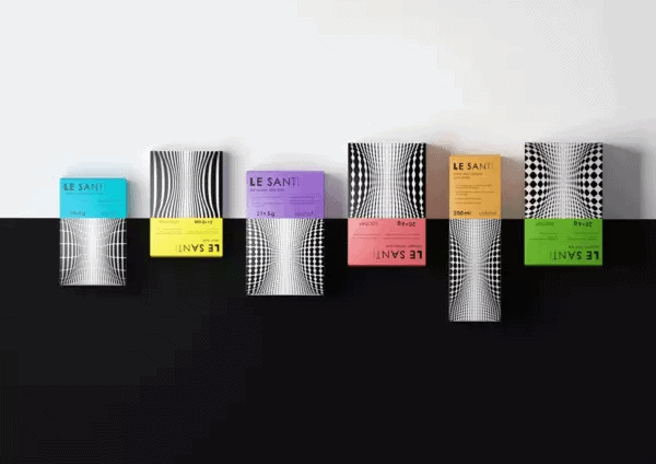
How do you know that the design is good?
How do you know that the design is good?
For example, you are a business owner. The designer made a logo for you. And shows it.
Or, let’s say you are a manager. We came to a cool agency. We ordered packaging from them. And you see her.
Or are you just the most ordinary person. You open Telegram in the morning, and there is news about the rebranding of the country’s main bank. And the picture.

How to understand: everything that you see in front of you is good design? Is it possible to understand this at all without having an art education? What are the hallmarks of good design and what are bad ones? How does it all work?
Common sense rushes to our aid. It will help to move aside from “I don’t like circles” and “my mother believed that purple is the color of loneliness”, to formulate an understandable, harmonious, and most importantly, objective system for evaluating the product received.

The graphic design that works in the branding area is very applied in nature. It is important to remember this at all times. It does not exist for future generations, but to address specific marketing and communication challenges facing the brand today. Therefore, in order to understand exactly whether the design is good, you need to remember the product for which it was created. And ask yourself key questions.
Who is the target audience of your product, its core? It is important to always remember who you are working for. The wording “for everyone” is a cowardly reply. “For all” means “for no one.” And this audience will not bring you either money or fame.
The more accurately you imagine potential customers, the better you know them. Follow them, listen to them. Think about what drives the audience in the products of this category? And what, on the contrary, is a barrier to purchase. Your design can play on the first or be the answer for the second.

What is the uniqueness of the product, its distinctive feature? Modesty is the shortest path to obscurity, figure out what the personality of your brand is and broadcast it to people. A unique brand is easier to spot and easier to sell. The experience of otvetdesign confirms: this rule always works, even in the most conservative markets.

What is the brand’s character? Who is he for the consumer? An expert assistant, a fun buddy, a trusted friend? The chosen role will leave its mark on both the design and the communication of the brand.

What’s going on in your market segment? What are the neighbors on the shelf talking about to the consumer? What are the industry design standards? Study them, understand the general pattern, perhaps find an unoccupied niche. And let your design be about that.
Evaluation of a solution in branding always comes from goal setting. Design is no exception. It is important to rely not so much on pictures as on the meanings embedded in them. “Like” and “dislike” are random words that should be avoided when making a decision.
What are you doing? For whom? What for? What do you want to achieve? The more honestly and succinctly you yourself answer these questions, the more clear the design evaluation criteria will be. And the more accurate solution you can choose.
Source: vc.ru
…

