
")
disassembling interfaces from a scientific point of view (# 1/3)
Affordances are a hidden language for interface design. With their help, we can literally “guide” the user inside the interface. But inappropriate use of affordances can seriously harm a brand or product.
It is customary to distinguish several types of affordances.
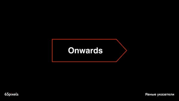
Explicit pointers… Explicit affordances rely on familiar things that prompt the user to take action. If a button on the site looks like a button in the physical world, you know that you can click on it. If there is text or an icon next to it, the affordances become even more pronounced: they tell how the system will respond to your action. Something blatant like the text “Click here” belongs to this group.
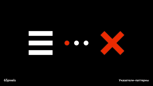
Pattern pointers. These are trends and habits that have become popular to the point of common understanding. Blue and / or underlined links. The logo that returns to the home page. Gray text in form fields. Profile link in the upper right corner. Highlighted and gray dots showing position in multi-step assignments. Arrows to scroll through the carousels. Navigation from above. Continue on your own.
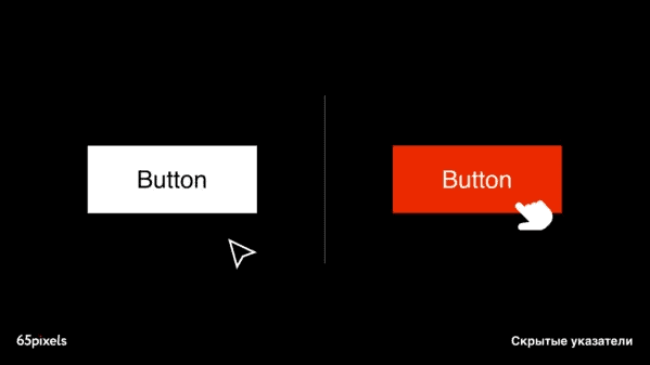
Hidden pointers. They remain invisible until certain conditions are met. For example, you accidentally move your cursor over text, and the text changes color to indicate that it is a link. This is an example of a hidden pointer, a subtle but useful way to show functionality. If you’re familiar with Pinterest, you’ll remember how the ability to pin, send, or like a photo only appears on hover.
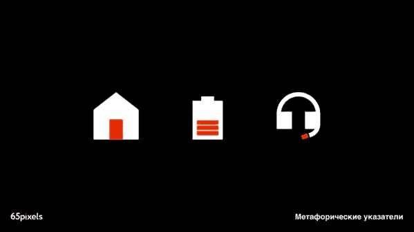
Metaphorical pointers. A simplified house icon symbolizes the home page, an envelope means email, a folder means … a folder. These are all examples of metaphorical pointers relying on the user’s common sense (and familiarity with everyday objects) to establish correspondence.
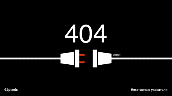
Negative pointers convey unavailability and malfunction of something. The most common negative pointer is gray text – it renders an inactive element. Skillful use of negative pointers will divert attention from inactive functions and point to more useful ones at the moment. Gray text fades into the background, while black clickable text remains visible. The use of gray text to indicate inaccessibility has become so popular that it has become a pattern.
Affordance can be used not just as a tool, but as a method, logic.
…
With this logic, you can control the user’s attention depending on the design problem. To highlight accents, prioritize information and, in the end, immerse it in a voluminous and complex product in an easy and understandable form for the user.
It’s a shame that such a useful thing as affordance can be easily overlooked in the pursuit of a non-standard, unusual interface. The following mistakes are most often made:
- There is no menu or home button. And in order to open it, you need a swipe, which is not indicated by an icon or a hint.
- A brand or company logo appears too often in important blocks of the interface, focuses on itself, distracts from really important information and overloads the visual and composition.
- Interactive (clickable) elements – buttons, links, illustrations – do not stand out from the rest of the content. Small, faded, bulky, unattractive – they will not be noticeable, they will be overlooked. And along with them are useful features implemented in the application.
If you want to build an interface on new, non-standard principles, be prepared to invest not only in development, but also in marketing. When introducing new approaches, you will have to set aside time to build user habits. Product brands spend years doing this.
PS In this article, we figured out the theory. In the next part, we will talk about specific tools that will help to apply the considered approaches in practice and design a design taking into account the psychophysiological background and established patterns.
Source: vc.ru

