
Design terminology. Part 1
Design terminology. Part 1
Geek studio employees decided to help all non-designers understand design terminology: how a logo differs from branding, RGB from CMYK, and why all designers need a vector logo so badly.
We are publishing the first part of an informative article that you can safely distribute among your customers: explain less to you, and ask less to customers.
When they say to you: “Send the source in raster in layers!”
You hear: “[email protected]# $% & `”?
We will help you figure it out! We have prepared a glossary of terms that you have heard, but never understood what it was about.
Use them and you are guaranteed respect and respect from arrogant designers and taciturn typography! ![]()
General terms
So let’s get started.
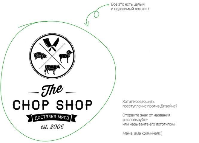
Logo = Trademark = Trademark – this is the spelling of the name plus a graphic image (emblem or sign). Sometimes it is also a decryption or a signature. This emblem alone should not be called a logo unless it is used and recognized by customers without a company name.
Only a logo is NOT a brand. A brand is a collection of visual images and advertising media.
In addition to the standard – combined, there are also text and symbolic logos.
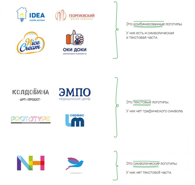
There are no good or bad ones among them. They are all working tools. All of them are needed and important for their business area or task.
Combined logos are a good old classic. They are needed in order to graphically either hint at the activities of the company or convey the mood and support the brand concept as a whole.
Text messages are suitable for manufacturing companies or companies with difficult-to-understand activities. Here you make, say, super-technological bags for compound feed. One trait knows what to draw in a graphic symbol for a logo! Or you cannot predict exactly what the assortment will be in a year or two – make a beautiful outline of the company name, and this logo will be relevant at all times.
Symbolic logos are suitable for creative organizations, free artists, artists. An excellent tool for viral marketing – they painted an unusual logo with a stencil or in graffiti and next to the phone number or website address. And we rejoice in effective advertising.
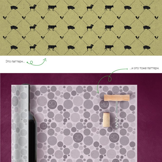
Pattern = Ornament = Pattern Is a branded wallpaper. The magic wand. If you don’t know what to place on the layout or you need a layout very urgently – use a pattern!
Identity = Brand Identity = Visual Communication System – this is your brand. How the company is viewed in general by your customers. This is a collection of a logo, sign, business card, poster and banner (and any other media for corporate identity).
Guideline = Guideline = Corporate Identity Guide – a document that explains in detail exactly how to use the developed design.
Content:
- concise brand philosophy;
- a short legend justifying the design concept;
- logo, fonts, colors;
- template design elements (pattern, photos, etc.);
- examples of building layouts (square, vertical, horizontal, as well as in large and small formats).
Who needs? Companies with branches. Companies whose advertising production / design is done by more than 1 contractor. In these cases, you need a single document with clear instructions: how and what to do. A company without this document risks recognition! Each performer will certainly use their own font, their own shade of color, arrange elements and select photos to their liking. The bottom line is that your brand will change beyond recognition.
In order for the brand to always remain itself, and not fall victim to the crazy pens of the printer, this document is needed – the Guideline.
Brand Book = Brand Book = Brand Book Is a full-fledged corporate identity, designed in one beautiful multi-page document. The difference from the guideline is the availability of ready-to-print layouts. As a rule, the marketing part is spelled out in more depth.
Content:
- philosophy and brand positioning, its values and principles;
- a legend justifying the design concept;
- logo, fonts, colors;
- template design elements (pattern, photos, etc.);
- further, at the option of the Customer, ready-made layouts. It can be anything: business card, outdoor, website, interior, etc.
Advertising communication – as a rule, this is a series of layouts for outdoor advertising. Now it is fashionable to use the term that way.
POSm = POSm – this is a souvenir (pens, notepads, mugs, etc.) and a handout (brochures, business cards, leaflets, presentations, etc.). Explanation of the abbreviation – point of sale materials. For retail outlets, these are glasses, napkins, boxes, bags, stickers.
Point of contact – the term of the famous marketer Igor Mann. These are numerous and varied situations, places and interfaces of contact between the client and the company. Every time a customer contacts the company in any way, at any time, a point of contact arises.
SKU Is one type of product. Buzzword! Explanation of the abbreviation – stock keeping unit. For example, yogurt with blueberries – SKU number of times, yogurt with strawberries – SKU number two-s, yogurt with peach – SKU number three-s!
ZhZL: from the life of wonderful people!
Real phrases. Caution, not for the faint of heart!
– Well, you can take this photo of a hot dog, add pickles, remove the mustard and change the angle of view ?!
– I sent you a picture in the Word, it is suitable for a billboard ?!
– Why such an expensive logo? It’s just an icon and a font!
Technical terms
The further into the forest, the thicker the partisans.
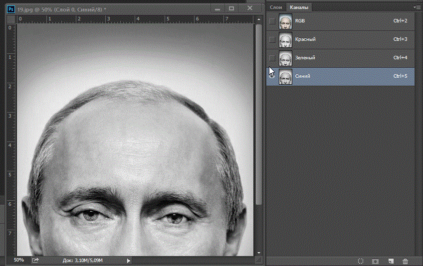
RGB – a color model that creates an image on monitors. Decoding: RGB – red, green, blue (red, green, blue). Any image that you see on the monitor is made up of only these three colors. Magic, right? ![]()
CMYK – a color model that creates an image on the print (banner, business card, booklet, etc.). Explanation: CMYK – cyan, magenta, yellow, key color (cyan, magenta, yellow, black). Any image that you see in reality (except on the monitor) is composed of only these four colors. In order for the images to be bright and vivid when printing, our studio does not use a key color (black) and makes layouts only in 3 colors out of 4 possible.
“Send the source in vector!” – you are asked to send a file with one of the resolutions .ai, .eps, .cdr, .pdf. In such a file, text is overlaid on top of the picture or a simple layout is created entirely. They work with such a file in Adobe Illustrator or CorelDRAW.
A vector file consists of points and lines. It looks like this:
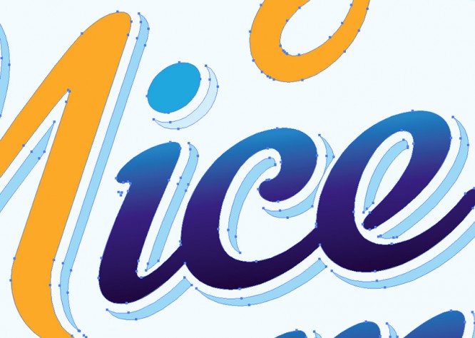
Its advantage is that you can make the image as large as you like and it will be of good quality.
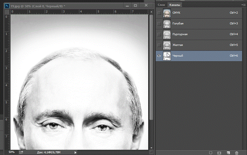
“Send the source in raster!” – you are asked to send a file with one of the permissions .psd, .tiff. In such a file, a processed photo or a complex layout (picture) with many effects. They work with such a file in the Adobe Photoshop program.
A raster file (any picture) consists of pixels. It looks like this:
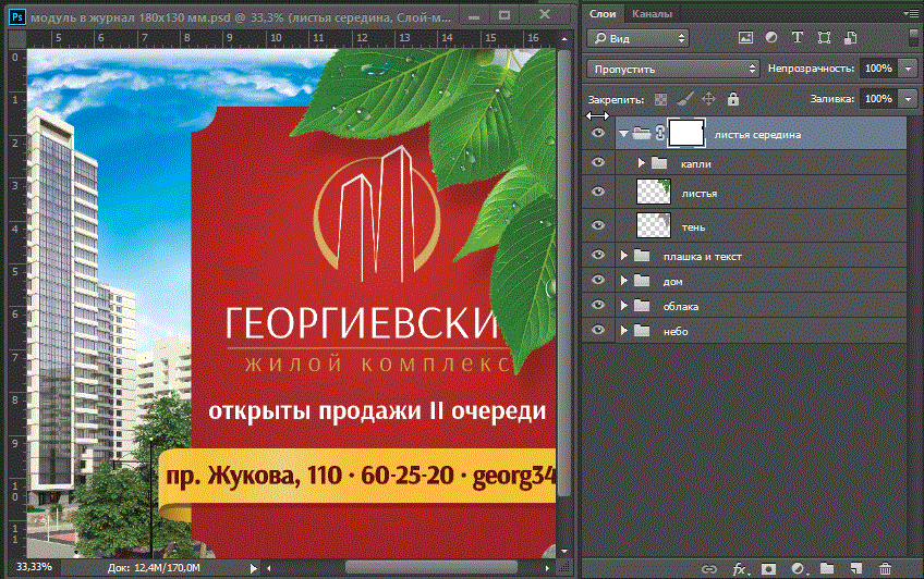
“Send the source in layers!” – you are also asked to send a file with one of the permissions .psd, .tiff. This is necessary to change the elements in the file independently of each other – remove / add text, move pictures or parts of them, resize, etc. When a designer makes a layout, he puts different images and effects (these are layers) on top of each other. It looks like this:
ZhZL: from the life of wonderful people!
Real phrases. Caution, not for the faint of heart!
– Not in a tooth with a foot, not a finger in a pixel!
– Photoshop, moto shop … yes, I will draw it in a pint!
– Here you are designers like to bother … take a picture in Yandex, on top of the slogan, and you’re done!
– We cannot physically change the layout without having the source in the layers.
– God, I knew that it would be simply impossible to work with you …
Source: wearegeek.ru
Cover image: wearegeek.ru
…
