Design Presentation: What Could Go Wrong
Design Presentation: What Could Go Wrong
Six problems that can come up during a design presentation to a client

Situation 1. Witchcraft
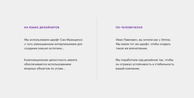
Vasya made a cool design. I spent a week on it, came up with cool animation and an elegant interface solution. He brought all this good to the client and began to speak beautifully with some kind of spells:
“We used San Francisco with slightly reduced leading to create a casual aesthetic …
The client listened honestly for about ten minutes. He was silent, making a complex face. Then irritation got the better of, and the client began to interrupt, sharply criticize, reject any decisions, and at the end of the meeting he even remembered his nephew, who would draw no worse. The presentation failed, the client is dissatisfied, and now the edits have to be worked out as well.
Something went wrong: terms. Vasya used the avian language of designers instead of speaking the human language. The client did not understand anything and rejected the work, because he did not see any benefit in it, but saw only an object of self-affirmation.
How not to screw up: do not use specific terms from the world of designers. Talk about the benefits of the product, not about visuals. Improve your explaining skill (explain complex things as often as possible, ideally every day, to different people).
The client (if he is not a designer), in essence, does not care what kind of leading you have there and what aesthetics. It is important that the design suits the product and solves the problem, and by what methods is already the concern of the performer, not the customer.

Situation 2. A thousand little things
Pasha came to the meeting to present the concept, began to tell the client about the design, and then they argued whether blue was combined with yellow. A serious battle has begun: what do these colors symbolize? Isn’t it true that blue is melancholy and yellow is suicide?
The dispute about the color spilled over into the discussion of the shape of the banner, then the size of the font on it, then they started talking about the dilemma “Caps or lowercase?” As a result, two hours later, Pasha had a lot of remarks in his notebook that had been forced out in the course of a dispute about trifles. Leaving the meeting, he suddenly realized that he did not understand at all what all this was for. Why is it so important to use a different shade of blue? Who needs a banner? Does the concept solve the problem at all or not?
Something went wrong: during the meeting, the focus shifted from the task to the nuances of the technical implementation. This is normal when the general concept has already been approved, and we are talking about a deep study of the interface. But when the concept is just being discussed, you need to keep the focus on the big picture – to understand whether we are moving in the right direction.
How not to screw up: Try to speak at the presentation about the problems that design solves, and not about the nuances of implementation. And, if suddenly you need to clarify some important thing on the visual side, start from the task.

Situation 3. Format mismatch
Anton brought a jeep to the meeting using a link that does not open in Explorer. When the link still manages to open, it turns out that the layout does not fit the entire screen – it is either too high or too small.
The client does not understand how it will be on his screen resolution and asks to stretch the picture, remove the margins, or something like that. Anton tries to explain that on a live site everything will not be the same as on a jeep, but the client doesn’t really believe. He’s scared to agree on what looks buggy. It’s one thing – the words of some barely familiar designer, and another – your own eyes. The client believes them more, and therefore persistently insists on adding margins, decreasing or increasing fonts.
Something went wrong: two factors combined: the client, who does not understand the technical part very well, and Anton’s inattention to the device on which the presentation will be watched. With the layout, maybe everything is fine, but because of the jambs in the presentation, the client got the feeling that this was not so. It is difficult to dissuade in words – a new demonstration is needed.
How not to screw up: find out in advance from which device the client will watch the concept, what browser he has installed, what screen resolution and what is the security policy of this company (for example, whether your file hosting service is blocking them by a firewall).
Situation 4. Too many options
Lena worked on the concept for a week and a half. During this time, I generated twenty drafts. Half of the options differ slightly from each other: somewhere the font has changed, somewhere – the shade of color or hovers on the buttons.
Lena did not know which option would suit the client better, so she brought all twenty to the meeting: they say, here is a mountain, choose from it what you like. Lena thought she was doing the right thing: the client will look at a bunch of options, realize that a lot of work has been done, and immediately choose something. It might save a few rounds of revisions.
But suddenly everything went awry. The client was stunned by the breadth of choice and began to ask unpleasant questions:
– Look, how do I know which will work? Can’t you just give one normal version instead of playing with the fonts?
Lena is killed: all work has gone to dust. Now we need to generate other solutions, but the strength and enthusiasm are gone, and it’s not even clear what to rule. Where to start, what to start from?
Something went wrong: the selection stage is skipped. Lena generated solutions, but did not sort them by viability, did not delve deeply into the business client to figure out which of the layouts is close and which is not. The client expected the performer to do the initial screening himself, but it turned out that the designer put it on his shoulders. Do not do it this way.
How not to screw up: change the approach. Not show a ton of drafts, but show one or two good solutions and be ready to correct in case of a failed hypothesis.
A stack of drafts can come in handy in case a client asks for something you’ve already tried but shallowed. But it is worth showing it only when it comes up at a meeting. The default is not necessary.
It is also helpful to discuss drafts in advance with the art director or (if there is no art director) with the manager involved in the client’s business. They will let you know when the designer gets in, and they will be able to steer in the right and viable direction.

Situation 5. A wrapper and a candy
Natasha created a concept for a service site focused on UX rather than UI. The task is to do without any special frills, complex interactions and animations, but with a deep study of logic.
Natasha was worried that the layout was very simple from a visual point of view. I wanted to add beauty to impress the client at the meeting more. Natasha had a term of five days; she spent three days on the layout and two days on the presentation, trying to lick it down to the smallest detail.
At the meeting, flaws surfaced: incomplete states in filters and forms, incomprehensible logic in navigation. The client was left at a loss: a presentation case in the spirit of Behans is, of course, great, but why is this all? We need a well-designed interface, not pictures.
Something went wrong: the presentation took too many resources: time, attention, energy. It was not the product that was more important, but the impression that needs to be made on the client. Because of this, the solution remained damp.
How not to screw up: keep the candy wrapper / candy balance. Without a presentation, nowhere: the candy should have at least some kind of candy wrapper. But the candy wrapper is less important than the candy.
The normal balance for an agency is 80-85% of the time for the product and 15-20% for the presentation. If tender or presale, presentations can be allocated 30%, but not more.
…
Create a template for simple presentations, where you can fill in ready-made layouts in ten minutes, change the texts and go to a meeting. This template will save you in the face of tight deadlines and prevent you from losing priorities.
Situation 6. All design by
Tanya made the design. Thoughtful, based on analytics, with clear hypotheses and fresh UI. I discussed the layouts with the artdeer and the manager, corrected them, saved a stack of drafts, arranged everything in a good presentation and presented it adequately at the meeting. In general, at every stage everything_ did_ well.
And the concept did not go globally. It turned out that the client expected something completely different, he didn’t like the solution, he wasn’t close, formed incorrect positioning, did not take into account the most important scenarios, and so on.
Something went wrong: there was a global misunderstanding at an early stage, even before the concept. The briefing may have been mishandled. Perhaps they didn’t get to the bottom of the client’s pain. Perhaps the project was started by one person, and now it is supervised by a completely different person with a different vision.
One way or another, these are not conceptual problems, but communication problems. Here you need to get together for a meeting again, carefully state all expectations and start over.
How not to screw up: accept the idea that the designer is not a telepathic person. A design concept is always a hypothesis. She may or may not fire. You cannot control one hundred percent whether she comes in or not, and it is normal to miss the design when clear expectations are not stated.
If “misses” occur frequently, it is a signal that the questions for the briefing need to be reconsidered and the goals discussed more thoroughly and intensively with the client.
But, most importantly, try not to be overwhelmed by such cases. Sometimes, if the layout violently does not fit, it’s even a blessing – at least now it’s clear in which direction you should not move. An inappropriate direction helps you find the problem better.
Source: DesignKabak
…


