Creating complex variable components in Figma
When I started tinkering with variants containing many properties, I realized that a project could grow exponentially more complex. With the help of my team, I was able to narrow the scope of the component being created and test it thoroughly.
This article is for designers who have a basic knowledge of variations in Figma and have already created several. Hopefully, it will help you understand your version and give some useful tips on what to consider before creating it.
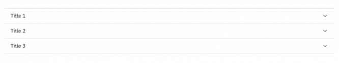
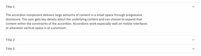
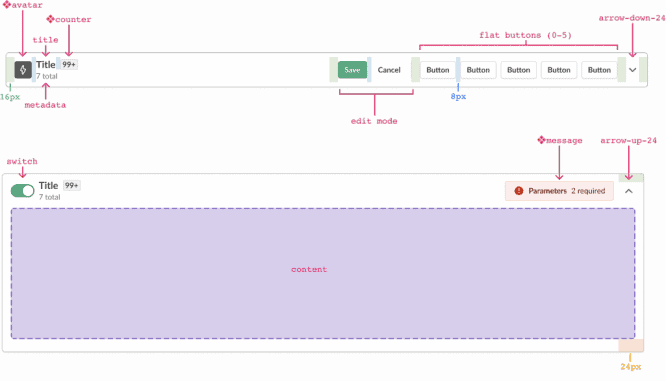
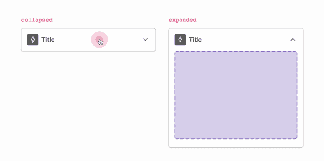
As an example, I will describe how I created folding card component. Although we among ourselves in the team call this interface element folding card, it is better known as the accordion. When collapsed, you can click on it to expand and see more content.
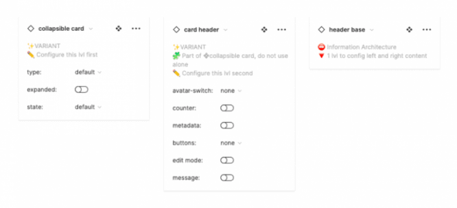
The variation I’m creating will include 6 header properties, 2 card types, 2 component states, and 3 card states:
Procedure:
1. Plan your information architecture
Get an idea of how complex the variation you are about to create by multiplying all the properties together.
For example, if you have 2 type, five buttons and 3 fortune you will have 2 * 5 * 3 = 30 options.
It is normal when in one version there may be up to 1000 components, but try to limit their number as much as possible.
What you should pay attention to:
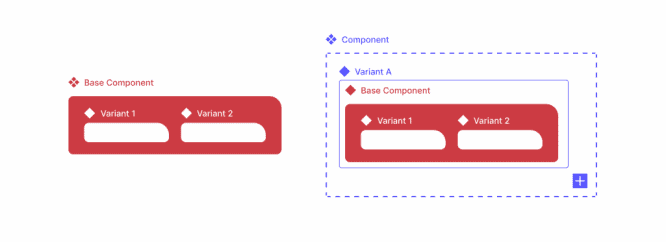
- Always try to create a “flat” version – Limit the number of attachments and layers as much as possible.
- Think about conditions that will never exist together – this will help you determine what properties you need. My foldable card will never have an avatar and a toggle at the same time, so I combined these properties into one (avatar-toggle) instead of two booleans (avatar = yes / no, toggle = yes / no).
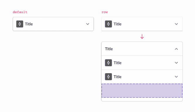
- Use nested variants deliberately – nested variants help to reduce the number of components that need to be created, but also increase the likelihood of your variant breaking during setup and requires additional testing.
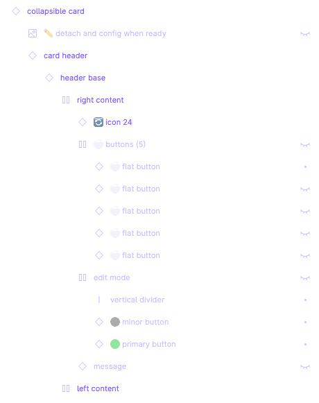
- All custom items should appear in the instance exchange panel… I decided to add a boolean property to show or hide a group of 5 buttons, and then left the toggle of each button to the designers. However, I realized that designers should complete 6 levelsbefore moving on to the configuration options. In addition, they may not know that the buttons are available in this option. It was much more convenient for me to create a variant property named “buttons” with parameters “none, 1, 2, 3, 4, 5”.
- Your team may need to detach the variant for further customization – Consider how you can help designers set up the instance correctly before detaching it from the main variant. It can also help you determine the order of properties. Our team usually leaves the setting fortunes property at last to accommodate this scenario.
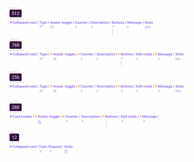
- Strip the property causing the most exponential expansion. If you’ve tried everything, but still have many variations, separate the property causing the most exponential increase in variation into a single variation, and then nest it back into the main variation. Thus, I managed to reduce the complexity – to go from one option with 768 variations to two options: a folding card (12 options), a card title (288 options).
2. Create base component *
Before creating a variant, create a base component outside of your variant and put all there. Add all the layers you want to turn on or off, the number of buttons you want to make available, items for different states, etc.
The base component helps you avoid wasting time making changes that might come after iteration, testing, or experimentation.
For example, if my team decides that we need to add an extra button as an option, I can simply add 1 button to the base component and apply it to the 288 choices – instead of going to to each option and manually add a button (in my case, add 1 button 288 times).
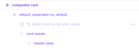
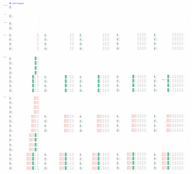
Much of the complexity of a folding card has to do with the content of the header, so I created a basic header base component that I enclosed in another card header frame. Then I used the card header to create a nested variation for all the required header variations.
3. Test and experiment
Before you start copying and tweaking variant properties, take the base component and experiment (try breaking it!). Swap icons, change colors, check constraints, resize and use it in a “real-world scenario” to see if it works when your team is actually designing.
4. Create options
Now that you are confident that you have a solid base component, create your variant in an orderly manner. I’ll leave this step to your discretion.
If you want fresh ideas, Figma has a great community file on options ?
* Other notes
- As a team, assess whether you want to prioritize maintenance of your design system or ease of use for designers. We decided to focus on ease of useif we ever need to make a decision. For this reason, sometimes our variations do not have a base component if this increases the number of layers that designers have to go through to get what they need.
- Remember, not all members of your team may be as excited about options as you are, and they don’t always have time to read the documentation, so try to keep things simple out of the box.
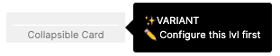
Review all layers and make sure they are neatly organized. Add warnings to layers your team shouldn’t touch and indicators to layers that your team should customize – emojis are great for that ⛔️.
Take a copy of your variation and review its levels. As you do this, check the Instance Swap panel and see the information that appears. Does this make sense for those who are poorly versed in options? Have you added descriptions?
For your information: main component descriptions are also displayed on hover in the resource library!
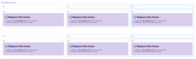
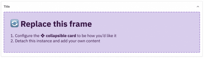
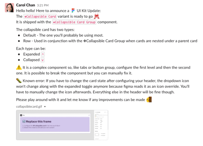
Make choices robust with built-in instructions – for the folding card component, I’ve added instructions for when designers should detach their instance and replace certain content.
6. Share your version!
Share your new version with some instructions on how to use it.
7. Current iteration
One final note: you probably won’t get it right the first time. Share the option with your team, let them use it, and ask them for their feedback.
Hope this article helps you master the options 🙂
Source: UXPUB