
Capitalizing on negative space in web design
Capitalizing on negative space in web design
Let me ask you a question: what makes a donut a donut? “Baker” – you say, and you will be right.
But the philosopher Plato would rather answer: “Form”, and, in the end, would add a completely paradoxical: “Hole.” Yes, the same hole that from ancient times was considered zero, nothing and even more. But a donut is unthinkable without it, which means that it is not so useless.
So it is with negative space in web design – for some it is just a side effect, but for others it is a visualization tool. Is it possible to turn negative space in your favor and what is it like?
Specificity

Designers of all stripes and ranks should remember that negative space is a resource. Not a ketchup stain on the couch – no need to mask it. A page’s equal authority.
The fear of emptiness provokes panic and numbness in the feeling of beauty in a novice website builder, and a site overloaded with graphic elements is not only a slap in the face of minimalists, but also a potential outflow of a less sophisticated audience: even if it’s ridiculous, it takes a long time to load.
On the other hand, an excess of negative space inspires a feeling of orphanhood or even a low-quality product. There is nothing you can do – learning to maintain a balance can only be done with experience.
Role in web design
A good marker of a compositionally verified site is the visual correspondence of elements to their status, place in the general hierarchy. The trick here is that neither the size nor the color of the elements on their own has enough power over the perception of users, which is often overlooked.
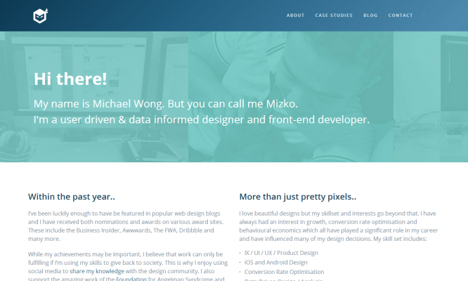
Take a look at the welcome speech of designer and programmer Michael Wong: it attracts attention not only due to the background, gamma, size and brutal nickname – the appeal here is separated from other blocks by emptiness. Almost an abyss. And yet it doesn’t look isolated.
Below, under the names of Michael’s admirers, are their logos – which are also generously flavored with negative space. There are only four elements, they are tiny and not that bright, but it was difficult to ignore them, right?
Classification
The conditionally negative space is subdivided into macro- and micro-.
Macrospace is the area between elements, without which, as a rule, a site is not a site. Headers, navigation bar, content blocks, footer, and outer borders.
Microspace is spoken of in terms of the relationships within these elements – between images, navigation links, and so on.
The idea of a macro is easier to understand, but not to execute: often designers focus too much on details and do not see the big picture. Therefore, forgetting about the subtypes of negative space in work is not a good idea.
Balanced design examples
The competent use of negative space is a thankless job: it is not visible until everything is fine. But not for us, and here are some illustrations.
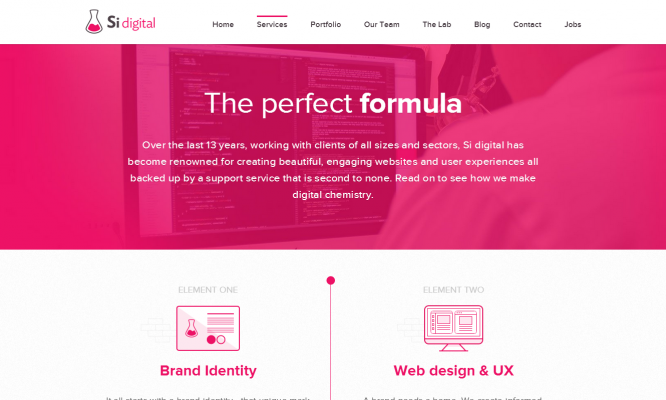
Design studio Si Digital with its website once again proves that balance and proportions are loosely related concepts. In general, the style is consistent, but the voids are used selectively: microspaces differ in the header and footer, they also differ in the text blocks. Nevertheless, one cannot say that the design of the site is internally contradictory.
The situation is similar with the Checkout application page. The alternation of slides with large and modest images is accompanied in this case by variability in the scale of the negative space played out. And even where the text is dominant, in terms of composition, it looks appropriate. Though unusual.
Author: Denis Strigun
…
