55 Easy Magazine Cover Design Tips
55 Easy Magazine Cover Design Tips
Designing a magazine cover is a pretty daunting task. This article will give you some general advice. We want to point out right away that these tips are for mass consumption magazines that are intended for sale at newsstands, etc.
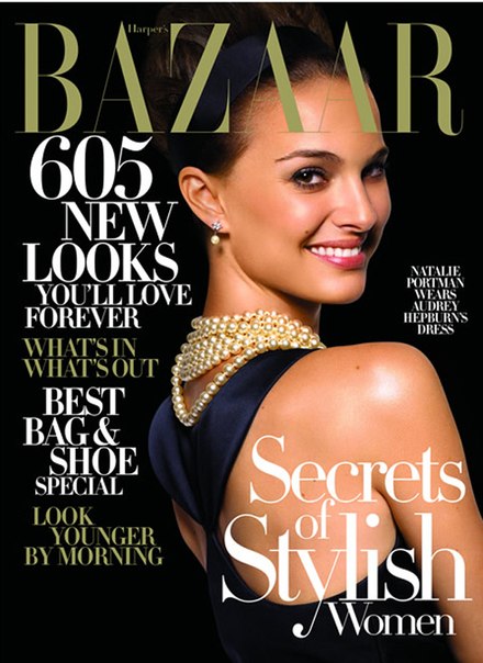
A good magazine can be identified by its cover. A cover without attention is a magazine without attention. Bad covers belong to bad magazines. They say you can’t judge a book by its cover, but if you apply this phrase to magazines, it’s just the opposite. A magazine is judged by its cover.
A good cover should make a potential buyer decide to buy a magazine. A good cover is your engine of commerce.
Design Tips
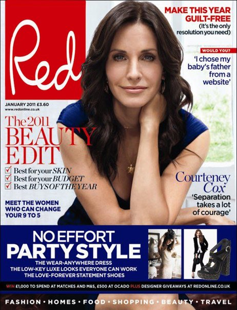
- The model’s gaze on the cover should be directed strictly towards the camera. Eye contact is essential.
- When creating a cover, you can experiment, you can exaggerate, but you need to stay within the chosen concept and style, to know which elements can be exaggerated.
- Each cover should have a headline that will catch the eye: its size, color, meaning.
- There should be some focal point on the cover. It could be a model, a headline, a number – something that will grab attention.
- The cover should be conventionally divided into three parts. The big one has a main heading, the small one has several headings, and the smallest one has a few more headings.
- If you are going to use orange for headings, then you should use spot colors. When printing in CMYK mode, getting a beautiful orange color is almost impossible – it will resemble brown.
- Green is the least common color on the covers, most often red. Whatever colors you use, make sure there is a contrast between them.
- The main color on the cover of the new issue should not coincide with the color of the cover of the previous one. Customers may not notice the difference: they think they have an old number in front of them and walk by.
- It is believed that black cover magazines sell poorly. This is a misconception.
- For small headings, it is best to use black on a light background or white on a dark background. Use colors for large headlines.
- There are no hard and fast rules about where the header of a magazine should be. If you think that deviating from the generally accepted canons will be useful (for example, placing a headline above the header and thereby increasing sales), then proceed with confidence. This is a great solution for magazines tucked away on the shelf behind other titles. In this case, the extra space on the cover might be helpful.
- In the United States, it is customary to arrange magazines vertically, so that the top third of the cover is visible – this is where the largest headlines are placed. They do it differently in Europe. Here, the magazines are arranged horizontally, and as a result, the most prominent part of the cover is the left third. Therefore, many European magazines have a “cap” in the upper left corner.
- Cover photos look better than pictures, and magazines with these covers sell better.
- It doesn’t matter how you get a photo of the model for the cover: you organize a photo session yourself or buy a ready-made photo in a photo bank – the main thing is that the background is a solid fill. A cover with a background of patterns or mixed colors is a designer’s nightmare.
Heading Tips
- Use a pun, but only when you are confident that your readers will immediately understand it. The prospect doesn’t have time to think about what you mean by this play on words. Everything should be clear instantly.
- If you plan on using a question on the cover, please provide an answer.
- The main title on the cover should appeal to the target audience of the magazine. For example, in a women’s magazine it might be diet, beauty, fashion; for men’s magazines, it could be sex, cars, fitness …
- Yes, sex sells, but its direct use can be a barrier to buying a magazine, especially for women. So use it implicitly.
- Repeat your best selling headlines from time to time. There is nothing to be ashamed about, especially if the headline was really great.
- You can replace one title with a list. Readers love lists.
- Use descriptive words to spark the reader’s curiosity.
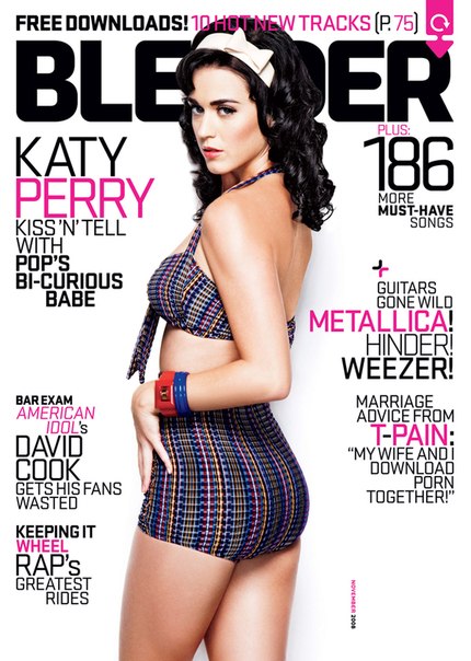
- Use numbers, they show how much there is in the magazine. Numbers often drive sales. For example, “22 best beauty salons in Paris”. By using a number, tell your reader that you have made a choice from a range that is much larger than the one indicated in the title.
- As you can see, there are no 55 tips here, this trick is used daily in magazines around the world to attract readers. But does anyone consider them?
Here are some of the tips to implement in your projects.
If you have a few more ideas, please share with us.
Source: Magazine Designing
Translated by Eric Asanov specially for Magazine Design
…

