How to make website design profitable # 4
How to make website design profitable # 4
An article written by Igor Abyzov and published on the Habrahabr portal about the basic rules of profitable website development. The article is written in 5 parts, we publish the third (first part, second part, third part).
Today we will turn to the topic of prototypes. Immediately I want to ask 32% of readers who are already aware of this topic, not to interfere with the remaining 49% who have not tried working with prototyping services, to understand this issue (according to the survey “Do you know about the existence of services for prototyping” part 2).

Prototyping theme
Here it is probably best to tell more abstractly than to concretize and dwell on one of the services, since there are a lot of them, unlike other types of work – more than 50 popular ones. For those who are skeptical, I will say right away – if I went to my room a few years ago and tell me how much time you can save and how much you can increase the return, I would immediately buy a prototyping service right now.
One beautiful sunny morning, having come to work and made a mug of strong coffee, I decided to open the mail from a client – and I wanted to pour this burning coffee on it, run a mug into it, break the contract and force him to eat the models he signed (in the letter, the client wrote, on half of the finished works: let’s redo the top, bottom and two pages – the main page and the list of services).
And it was then that the designers and I began to think about what we were missing, what we were not using: the technical assignment was, the project documentation was, the sketches on the board were available, the client signed the layouts one at a time – yes. And someone said skeptically – “can we try prototyping ?!” We immediately went on a spree, read, chose the application and bought it. And they bought it immediately for a year for $ 69. I liked that there is a 25% discount on purchases for a year. But that’s not the point (it was mockflow.com). Here is an article on Habré about prototyping services.
We spent a day on trial attempts to study the application. Two days later, the designer gave me a long link (I note right away: a huge, simply incredible disadvantage of this service is that it is on the flash), which opened the entire prototype of the site. Everything took less than 16 hours (the site was small, up to 10 pages + 404, alerts, a short menu, a letter to the client – in general, a complete set). I have already moved a little away from the client’s letter and am writing to him: they say, “look at the whole project as a whole, the site will be like this, no more, no less; view all pages, study the entire project; your site will look exactly the same, only in color and with a photo; but its structure, menu, buttons … everything will be like on the prototype. ” And you know, the client told me that he no longer wants to change the layouts, he understood the whole concept of the site, and it suits him. We just saved a week of work, maybe more in the long run.

How to use
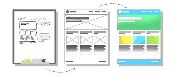
You have an idea, a site structure, a content piece, and a board. Write down general thoughts and ideas on the board with a rough marker. Discuss the concept with staff, programmers, and layout designers (take a photo and add the document we talked about in part 3 to the general google document). Further, the designer, having an idea of the project, having a sketch of the photo in the document, as well as seeing the structure of the project, is tasked with making a prototype. We spend from 15 minutes to 2 hours per page, and we have the whole project ready. The designer puts the link at the very top of the google.document in the information block.
We give the task to all project participants to familiarize themselves with the prototypes using the link in the general document. Next, we get together or write off right there. What we have? The entire project is a fully working version. Further actions: find in it inconsistencies with the layout. Those very little things that are always lost and finished at the end. The thing that no one likes is when the work seems to be finished, and the client or the manager continually throws it over and over again: “they missed the link here,” “and here we said there would be a check mark,” and so on. Look for all the shortcomings at once, everything that will then take more of your time.
All that you want to do “later”, immediately multiply by 2, and after a month and by 4 – these are your losses.
Finding “details” is the most difficult process. Sometimes you look at a site – it seems to be a good one, and then you see almost the same one, but it is no longer very good. Why? On the first, there is something small and not immediately noticeable – “details”. It is the “details” that make the design good and the resource convenient. Links to password recovery, 404 page: a formalized alert, a tooltip on the icon, a link to information and an explanation line. Why am I writing this here ?! My answer is that photographers still love to create black and white photos. They show more detail. The same is with prototypes – they make it easier to see all the missing details, buttons, functions, and in the end whole pages that were not foreseen at once.
Project structure
Throughout all the parts, I write about the structure of the project. Everyone sees her differently – but without her in any way. The most convenient, in my opinion, is the abbreviated version – no explanation, just listing all pages in nested lists. But to each his own. Moreover, in a file, this can be a multi-level structure, while on prototypes and layouts it is better to use two-level nesting.
Understand the designer or manager often at the time of creating the first layouts understands the project and sees it “from above” and completely. While the client, layout designers and programmers see him standing on the ground. They do not immediately understand what the project is doing, how it does it and why.
Your task is to show the project in a linear and sequential manner, one layout (prototype) after another. The client should open the first layout (prototype), and simply press the “right” button (next). Your task is to build the correct chain, make a structured presentation of layouts (prototypes). What will it give you? The fact that the client asks a minimum of questions and quickly accepts your even the very first layout – and this is your profit. Yes, he will tell you the comments, but these will be comments on the case, and not a hodgepodge in a mortar. The client will find the details that you missed now, and not on the last day of the project or a week later.
Where are the savings and profits
Storyboard the project. Does a site visitor perform any actions on the page? Is he injecting something? Does the site react to this somehow? Is it all on one page? Show the visitor the section “Creating an article on Habré”, which will consist of layouts:
answers on questions;
answers to the second questions;
empty post form;
form with empty fields (not validated);
preview form;
a form with all hovering and drop-down lists;
alert “your article has been published”;
Thank you for posting … page.
This is not one prototype, it is not three prototypes where everything is sketched. This is a storyboard during the prototype stage. The client, seeing this, will immediately understand how it works, how the site interacts with the visitor, which is a saving of your time and the client’s time. Going further: saving your team time. We humans are visuals, and we’d rather see once than hear 100 times. You will save a lot of time explaining to the layout designer how the page should behave. The programmer sees the functionality, and you save time. The same thing happens at the prototype stage – developers can discuss effects, technologies, they can remove what is difficult or impossible to do – all this is savings.
Moving on. The client must sign everything, approve and understand that there is no turning back. The layouts will be based on these prototypes, and just like that. Yes, they will be colored with photos, and the buttons are beautiful, but it will be just that. These are not words – this is a picture. Further, all the wishes of the client that are not included in the prototype are additional work that is paid for.
Outcome
Need even more facts ?! On average, after applying strict rules and prototyping, we managed to meet the deadlines and almost meet the specified limits for the allotted person / hours. Yes, I will not lie and tell that this is the solution to all problems, but meeting the deadline and budget is already making a profit.
In the next chapter, we’ll look at the “first layout” problem, explain what a structured presentation of layouts is, and consider an example of using these services.

Other parts: Part1, Part2, Part3, Part 4, Part 5.
…

