
7 popular customer misconceptions
7 popular customer misconceptions
Not so long ago, the news about 5 ways to spoil the logo was received with great interest. Continuing the topic, I will tell you about 7 customer misconceptions, which, by the way, also relate to the process of creating a logo.
1. Before making adjustments to the layout, think carefully – Will it help the proposed design to solve the problems of your brand? When working with a designer, you do not need to bring your own tastes to life, but create a visual message for your audience.

2. Without forming a task for the designer, you will hardly be able to see anything at all. Graphic design, alas, is not an abstract art, it is the answer to the task in the language of graphics and symbols. Remember that creatives are not magicians, they don’t read your thoughts, they embody them! Try to think carefully about what you came for, who should understand it (CA), and what tasks “it” should solve.
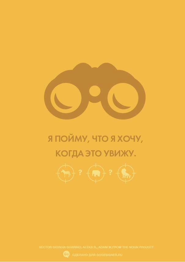
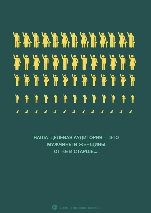
3. Remember that there is no “very diverse” target audience. You are unlikely to target your product in the same way for babies and mothers with children, as well as for businessmen, Muslims, sexual minorities and retirees. And even so, something other than marital status should unite them. Try to understand what motivates a potential buyer to use your service or product. Try to focus not so much on age and gender as on a psychological portrait.
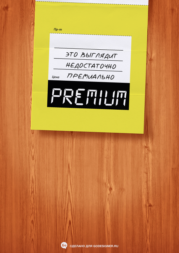
4. An expensive design doesn’t always have to look expensive. The price of a creative service should not be projected onto your product. Looking “budget” is also good, especially if you are targeting students, thrifty housewives, or retirees. Looking premium selling barns or Khrushchevs is more than deceiving, isn’t it?
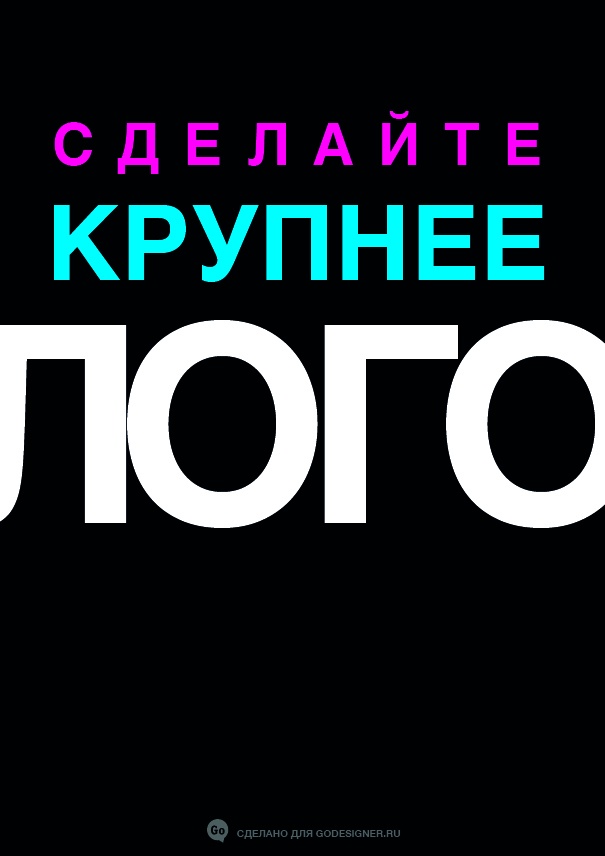
5. The complex to go unnoticed haunts all clients. This is normal. Designers, in turn, want fame, so that their work looks “festival”, with a small logo and an emphasis on a big idea. Try to find something in between: as a rule, 1/18 of the area of the 3 × 6 m layout will be enough for the logo.
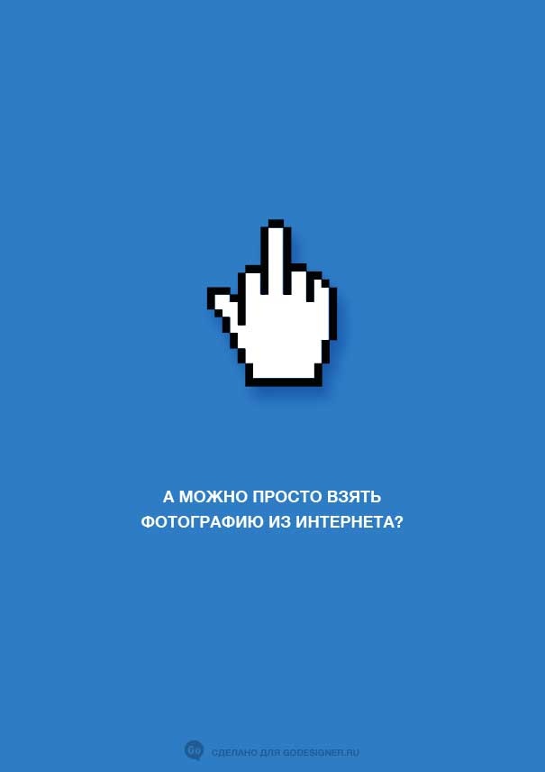
6. A photo from Google images cannot be “taken” for several reasons. First, the quality of images on the Internet is much lower than what is required for printing: for the Internet, a resolution of 72 dpi is sufficient, and for a printer from 300 dpi. Secondly, all the images belong to someone. Whether it be photography or illustration, it is painstaking long work that requires not only talent, but also money for tools and education. Thus, if you find a suitable image, you need to find either its author, or use it as a reference for the designer.
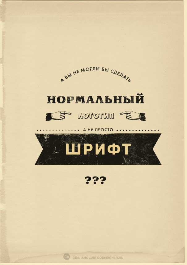
7. Initially, the logo was born as an outline of the brand name in the form of stylized letters. Today, many people call a logo both the font and the graphic part (sign), but most – only the font. Therefore, when creating a logo, specify what kind of logo you prefer and try to explain why.
Type design is the most time consuming and valuable area in graphic design. Each typeface has its own intuitive character. It can be austere or modern, it can look premium or playful, it can be suitable for texts or only headings, donate the association of a holiday, banking service, a history book or a love letter. In other words, before making changes, try to understand the associations with the logo: what this font tells you. There are plenty of examples where one typeface is enough: hipster Pinterest, masculine Gilette, feminine Dove, or dynamic playful Disney.
Based on materials from the site godesigner.ru
…
