10 logo design trends in 2018
10 logo design trends in 2018
It is very difficult to talk about trends in logos for the year ahead.
At Reynolds and Reyner, we believe that the logo, or rather the branding, should be done for at least 5 years.
Throughout these years, it must remain fashionable and relevant. Trendy. Better yet, set these trends yourself. For example, back in 2012 we created the Waldo Trommler Paints project, and in 2017 such a striking design became one of the 5 key trends according to White Rabbit.
That is, we felt the trend 5 years before it became fashionable, and they started talking about it in reviews.
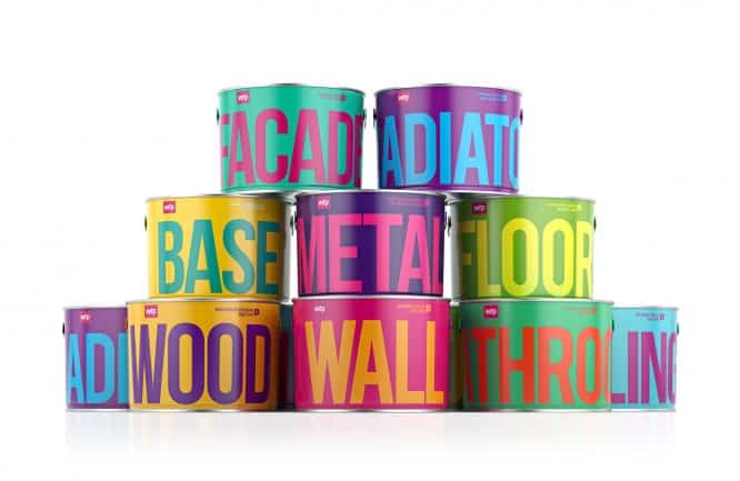
Reynolds and Reyner / reynoldsandreyner.com
Also, when reading the article, you should understand that talking about logo design is not entirely correct. A more correct concept is branding, branding system or brand identity. That is, a logo and a corporate identity that should work together perfectly. The above mentioned Waldo Trommler Paints project has quite a modest logo of three letters on a pink background. But it is a bright identity combined with a simple logo that makes branding, in general, special.
Therefore, there are 10 key trends in brand design:
1. Color squares
The first trend, which we think will be relevant in 2018, is based on strangely shaped colored planes combined with unusual color schemes. Pink with pale green, gray-purple with dirty yellow, coral with pale purple and other similar combinations of complex colors along with flat and angular geometry.
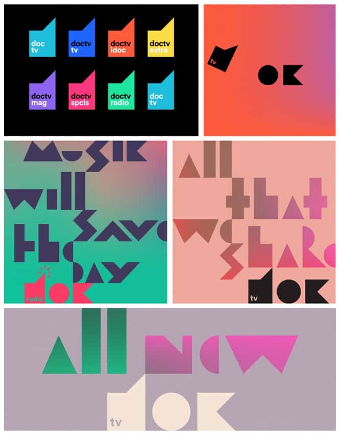
Betroot Studio / Behance.
2. Custom serif wordmarks
Quite noticeably, there is a tendency to move from original, often quite well-designed logos with memorable and harmonious signs, to simple custom and sometimes conservative letterings. Essentially, this is a transition from individuality to classic styles and a complete loss of self-expression. The trend is quite interesting and seems strange, but it is due to the so-called “principle of self-denial.” When brands that are most likely super experts and influencers in the industry focus on content and expertise. They show the true essence of the brand and what makes it valuable. But at the expense of not the visual image, but other branding techniques.
Function dominates design, rigid and clear.
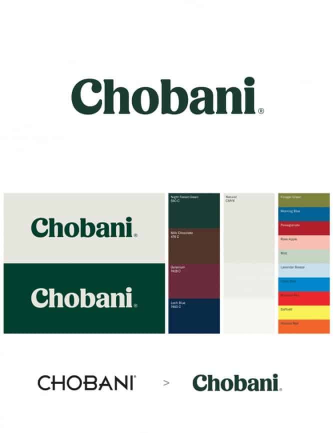 Source: underconsidiration.com
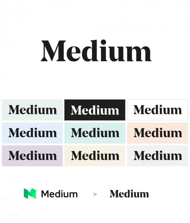 Source: underconsideration.com
3. Destroyed letters
Using the branding example of Graphcore, you can see how cognition works well in the geometry of the font character. Especially if it can be traced and actively developed in the design of all components of the brand. These logos provide the necessary uniqueness, character and personality. At the same time, it is reported that it will be enough to use the headsets that have been trodden thousands of times.
But do not think that you can just take and make some letters angular, and remove details from others.
Regularity and logic should be traced in everything, otherwise you risk losing the thoughtfulness of the concept and idea.
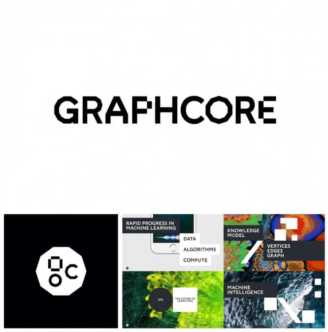 Pentagram / pentagram.com
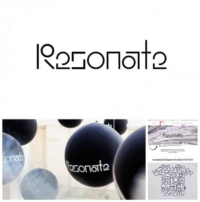 Pentagram / pentagram.com
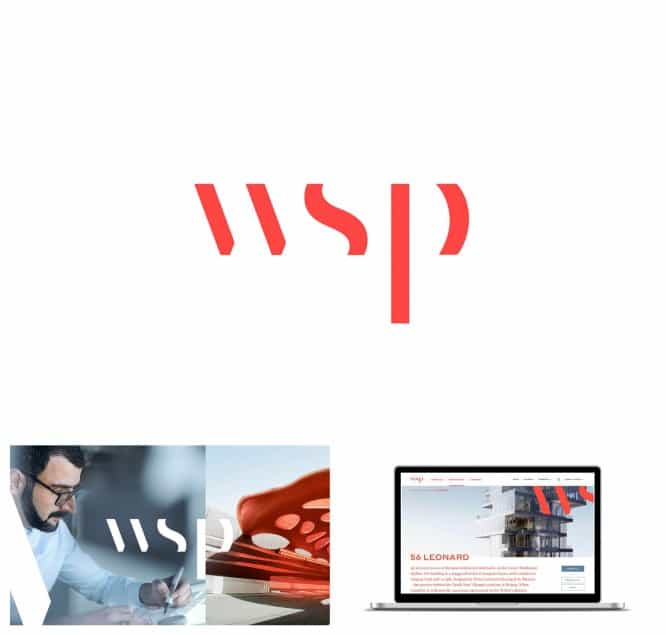 Sid Lee / Behance
4. Super bold
One of the most common trends of 2017 will be relevant in 2018 as well – these are super bold font logos. Everyone interprets and argues such a graphic solution in their own way. In the case of Kickstarter with their new logo, they kind of hint that the crowdfunding platform helps to collect the maximum number of bakers for a successful product launch. So the new Kickstarter is now fat. It’s bold. Why not?
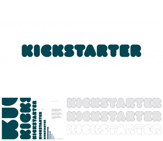 Jesse Ragan / underconsideration.com
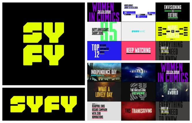 Loyalkaspar / trustcollective.com
5. Geometrical puzzles
A fairly common technique when a puzzle of logos is formed from simple geometric objects. In the case of Zendesk, this is the letter Z, made up of triangles and halves of a circle. A very simple, but graphic technique, thanks to which the elements of the logo can be used to brand objects in almost any way. Of course, lettering should very clearly reflect the same qualities as the mark. The trend is not that special, but simplicity makes it easier to perceive. Especially when it comes to a wide target audience.
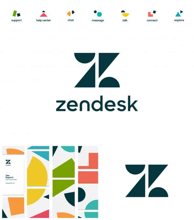 Zendensk / underconsideration.com
6. Monolign + hard color
One of the interesting and unusual trends that we observe is the use of lines of the same thickness. That is, all objects of the logo graphics are made of the same thickness using super-hard bright colors – so that the eye cuts. In this trend, there is a certain recognition of old school 16-bit graphics, but made in a pop art style.
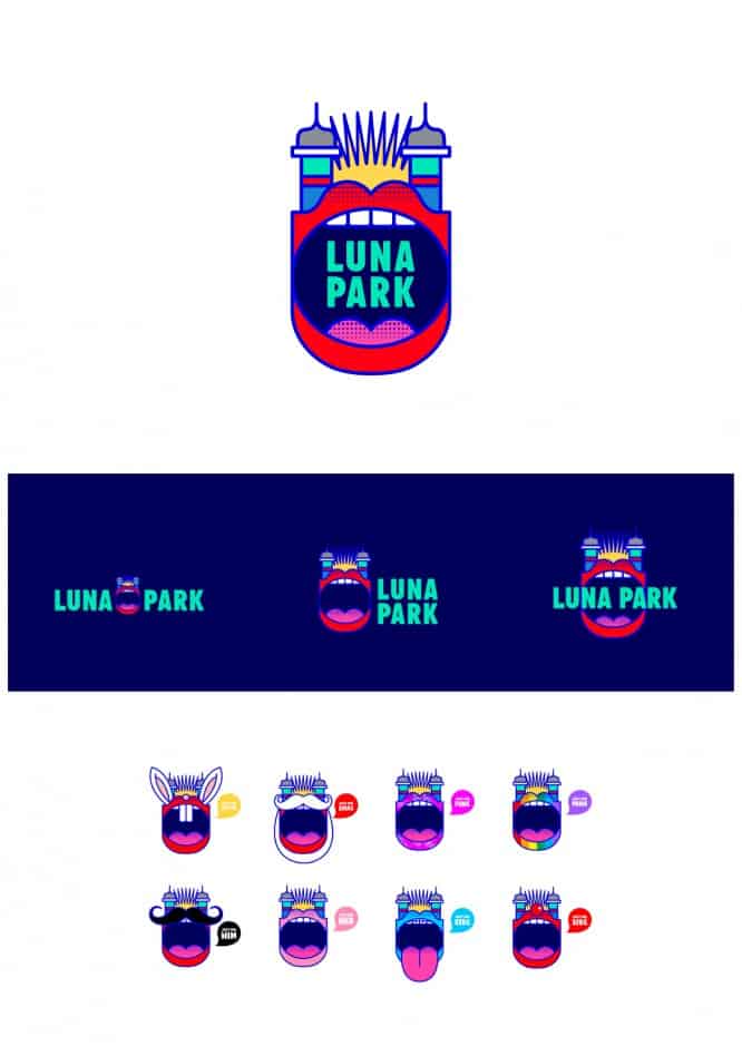 SML Design / underconsideration.com
7. Generative texture
A very interesting trick is using a code as a “designer” of the logo. Writing generative and randomizing data programs for obtaining interesting textures of pictures in order to achieve individuality of the graphic solution. In the case of SSE branding, a simple program was written that allows anyone to move sliders and change numeric values and variables in the menu. As a result, in seconds it is possible to obtain many variants of the execution of letters from different objects, lines or points. This is a great trick to keep your branding consistent even when your logo changes. We love to use it in projects to break stereotypes.
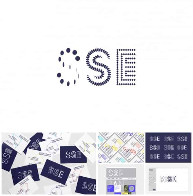 For The People / forthepeople.agency
8. Future classicism
Using the example of one of our unpublished projects, we illustrate a trend that is relevant earlier and in the future – the generation of graphics from different styles and concepts. Better yet, of generally incompatible things. Classical engravings, bas-reliefs, classical drawing and painting in a new reading and under a new look – all this is at the intersection of art and absurdity. Breaking the habitual perception of things, we try to say: “Let’s look at the world in a new way.”
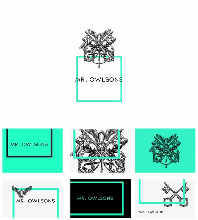 Project by Reynolds and Reyner, images courtesy of the author.
9. Superposition
The imposition of wordmarks, signs, and, in general, logos on illustrations, photographs and all kinds of graphics to create a single composition, which is the logo, is another trend of the next years. That is, the solution is not just to place the sign above, under the lettering or somewhere else, but to take a Wordmark, embed it over the graphics and tell everyone: “This is such a logo.” But seriously, with the advent of new service technologies and conditions for the consumption of goods, the understanding of the familiar logo has blurred. Then it will change even more, and the logos will become more and more unusual and strange. After all, there are already too many classic solutions “according to the rules”.
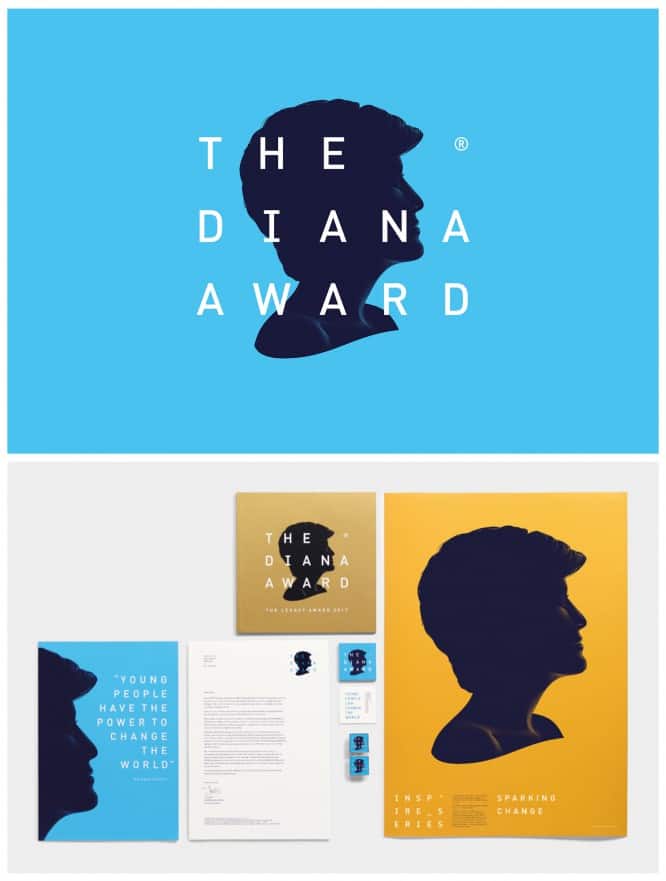 Jones Knowles Richie / diana-award.org.uk
10. Smart heritage
Using the Formula 1 rebranding as an example, we can appreciate how the agency conveyed the whole spirit of racing, bringing together everything that we liked so much about computer racing into a single rich style. Graphics at the intersection of digital retro and modern understanding of design have absorbed the heritage and gave a new impetus to development. Keeping its origins in itself, it strives for something new. Linking to the origins of the brand is becoming more and more relevant in design, reflecting the importance of heritage. It is important to embellish and enrich this heritage, giving even more visual value and a fertile ground for growth and development.
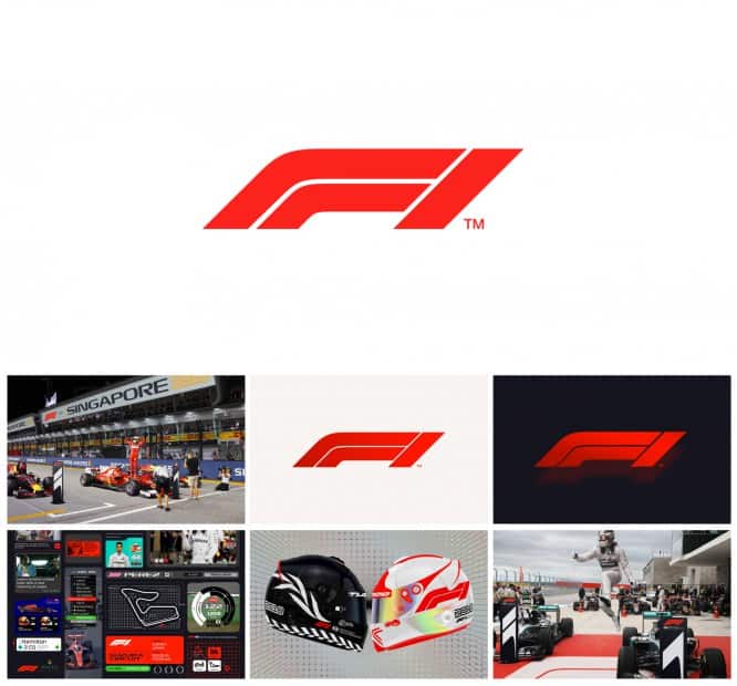 Wieden + Kennedy / wklondon.com
For the next 5 years, we are waiting for more and more daring decisions. Bold but beautiful. Strange but balanced. Decisions for which you would have been given a bad mark at design school. You have to break the rules to stand out. After all, within the framework of the rules, everything has already been invented. You make a project, come up with a cool concept, but sooner or later a similar solution will be found.
Therefore, the main trend of 2018 is courage.
Only this is not the courage that you drew on a piece of paper in half an hour. This is the courage that you work on for months.
Source: telegraf.design
…

